
At REACHRIGHT, we love a good church logo. Something clean, maybe modern, that communicates who you are as an organization. It should be easily recognizable, usable, and transferable. That’s why we’ve collected a list of the 15 best church logos in 2026.
We want your church to have the best logo possible! This top 15 list is meant to give you ideas and inspire you so that you can make the best logo you can!
Let’s dive in.
What’s a Good Church Logo?

Any church looking for a new logo should think long and hard about what it wants and needs. You will want to be in love with it because it is going to be everywhere. This logo will need to have a good lifespan.
It is not something you want to change often because it is essentially your calling card. When you go through all the work of branding your logo and church, you don’t want to repeat the process too often.
Branding
You should hope and plan for your logo to be highly usable. You should be able to really get mileage out of it. If it represents who you are as an organization, then you want to be able to use it on everything. You will want to use this logo on everything you project on a screen in your church, and you will want to use it on everything that you print and hand out.
Obviously, it will be front and center on your website as well. Do you like the colors? Are you ready to be married to those colors for at the very least the next few years?

Transferability
When we talk about a logo being transferable, we mean you can use it on your website, on a children’s church form, or even on your tithe envelopes. It is not made or used for just one purpose. This is important because it means you have a logo that is highly efficient and reusable.
The more times people see your logo, the stronger the branding becomes. This means you’ll want a logo that works on all different kinds of things, and maybe a black-and-white version for things you’ll be printing.
Let’s start checking out our list of the 15 best church logos of 2026!
15 Best Church Logos 2026
How do we choose the best church logos? Well, we look for a few key factors. We believe logos should be recognizable, usable, and transferable. Let’s explore the meanings of these 3 parameters throughout this article.
City Collective Church
![]()
This logo for City Collective Church is simple, clear, and meaningful. At first, it looks like a cross inside a circle, which is a clear image in and of itself. Closer inspection reveals that the cross symbol is made from two C’s, a tall C and a wide C, which stands for “City Collective”.
The logo feels modern, sleek, and industrial. If you check out their website, you’ll see that the church really reflects that. They have a lot of young adults, and they have a strong social media presence. Thus, this logo reflects everything that they want it to.
Why We Love This Church Logo
Overall, this logo shows what the church stands for: faith, community, and guidance. It’s a great symbol of the church’s mission and purpose. It also incorporates the name (“CC”) into the design, so it can be recognized and identified among other logos.
Cedarcrest Church
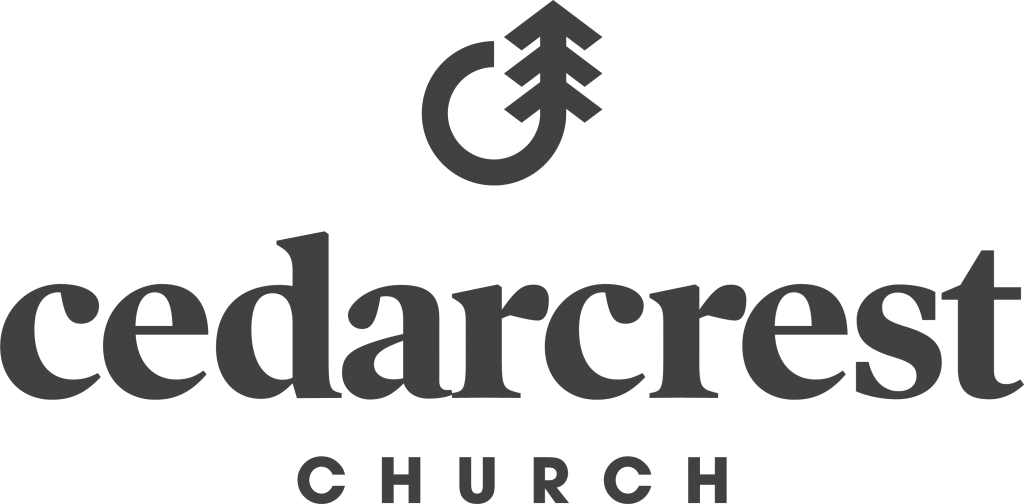
What a fantastic design from Cedarcrest Church! I don’t know what could represent the word “cedarcrest” more than this! The shape is an obvious “C” for “Cedarcrest”, and it curls up into a simplified image of a cedar tree. It’s clear, it’s bold, and it is a great visual representation of the name of their church. It feels modern and sleek, but not too corporate or cold.
Why We Love This Church Logo
Cedarcrest is able to pack a lot into a simple logo. Firstly, the logo is essentially one unbroken line, which makes it stand out very clearly and strongly. Secondly, its simplicity and lack of extra little elements around it make it very transferable. Anyone could see this design on a worksheet, a T-shirt, a nametag, and more!
Saint Rita Catholic Church
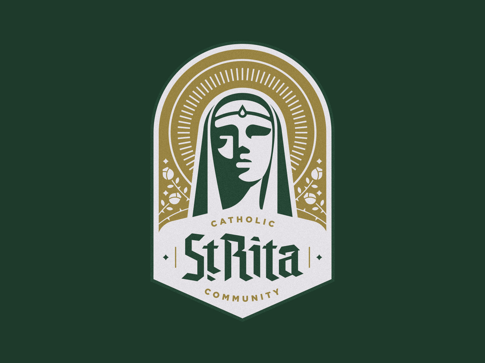
We were really excited to see the mixture of modern with a nod to the past. It’s not often that we see a Catholic church with this kind of forward-thinking. We really applaud the thoughtful design. The clean lines of the work are juxtaposed with the old-world font. The simple colors also make a statement.
Why We Love This Church Logo
This North Dallas community is doing a wonderful job of being relevant and communicating who they are. Saint Rita Catholic Church is a modern community that still embraces its past.
Harvest Church
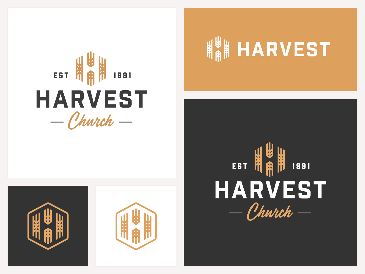
Harvest Church has a number of similar yet different logo/heading combinations. The color choice gives you the feeling of fall harvest without being cheesy.
The logo can be used alone without the heading/name and still be a strong presence. Within the logo, you can see that it is comprised of wheat that makes up the “H” for harvest. We personally like the drama and impact of the white heading on the black background. It packs a punch!
Why We Love This Church Logo
We love the versatility of this logo design. It is important to either have multiple ways to use a logo or simply just have one. This church went with the moldable approach, having a few variations all communicating the same message. Well done.
Limitless Church
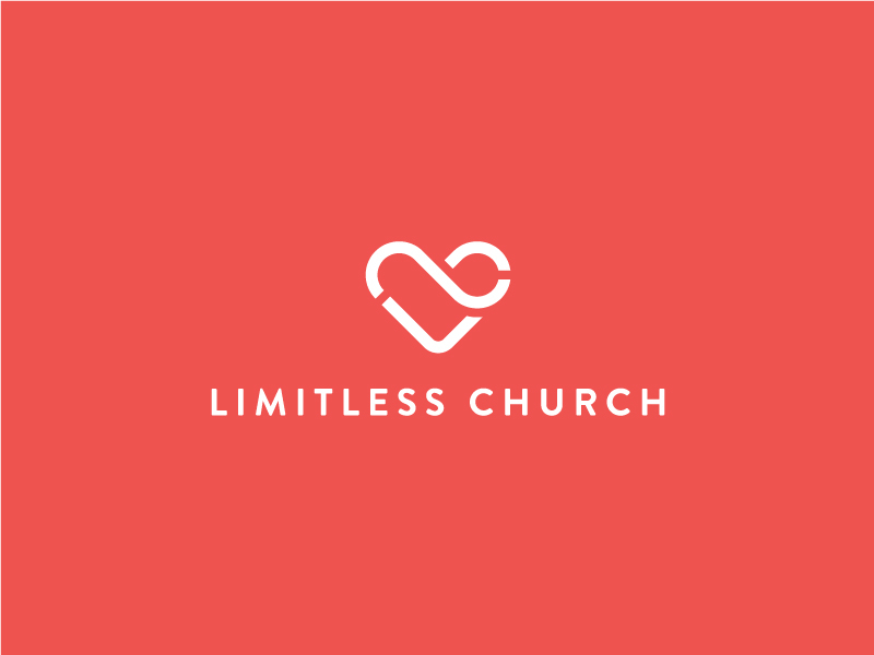
The logo stands out because of its basic nature. The choice of only 2 colors adds more impact. It could easily be used without text and still communicate the “Limitless” message by its use of the infinity symbol, incorporating love with the heart. It is powerful to use something that people are familiar with and turn it on its head. This is a very smart design and use of impactful color. Limitless Church does a great job with impact here.
Why We Love This Church Logo
We love the simplicity of this logo. The logo is able to be a symbol of who they are as a church. It is easily transferable, enabling it to be used in many different ways. It’s beautiful simplicity.
Concord Church

If you look at images of Concord Church on their website, you can see that the space looks modern, industrial, and strong. That’s exactly what this logo feels like as well. It’s an obvious “C” for “Concord”, but the “C” is blocky and thick and looks like the layout of a strong modern building itself. Of course, the winner here is the leaning cross smuggled into that “C” to mark this as a Christian church. The cross is clear, but it doesn’t muddy up the “C” either or make the logo messy.
Why We Love This Church Logo
This logo makes me “feel” the church building in a really unique way. I’ve never been to Concord, but from the images, it looks like going to the church feels just like how the logo makes me feel. It’s also highly transferable and can be used in color or black-and-white without losing any of its strength.
Grace Generation Church
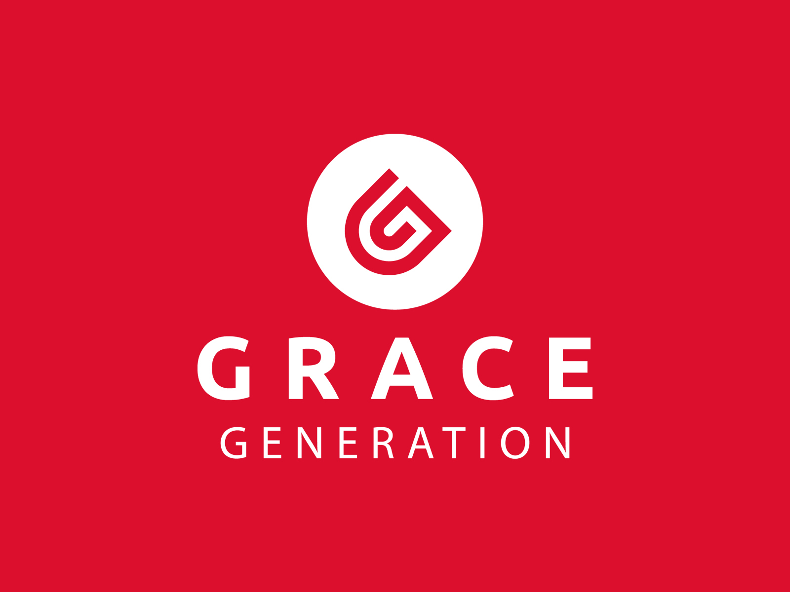
Grace Generation Church did a great job with their logo. The color has a lot of punch and enables the main icon to stand out with its white color. The central part of the logo gives physical interest while also serving a functional job. The white circle contains 2 “g’s”. The larger red “g “and then the smaller white “g” that is contained inside of it. There is a good change in the weight of the fonts. Bigger and heavier on the top and smaller and thinner for the second word.
Why We Love This Church Logo
We really like the cleverness of the small “g” hiding within the larger g. It makes it a highly usable icon for the church. Small and compact, highly transferable. This also makes it an easily used favicon. Your user can easily identify it among other favicons, standing out for its popping color and great design.
Cove City Church
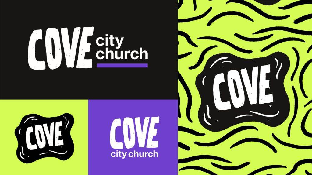
This logo for Cove City Church is bold, fun, and modern. The large, hand-drawn-style font for “COVE” grabs attention and feels inviting, giving the church a fresh and approachable vibe. The uneven texture of the letters adds a creative, personal touch that feels less formal and more welcoming.
The bright lime green and purple color palette is energetic and youthful, making it stand out from more traditional church logos. These colors communicate vibrancy and life, reflecting an exciting and active church community.
The use of different shapes, such as the wavy outline around “COVE,” adds visual interest and keeps the design playful. The combination of elements makes it versatile, whether it’s used on signs, social media, or printed materials.
Why We Love This Church Logo
This logo does a great job of making the church feel relevant and engaging while still being simple and easy to recognize. It’s eye-catching and full of personality. In a lineup among your average church logos, this one really stands out.
Decatur City Church
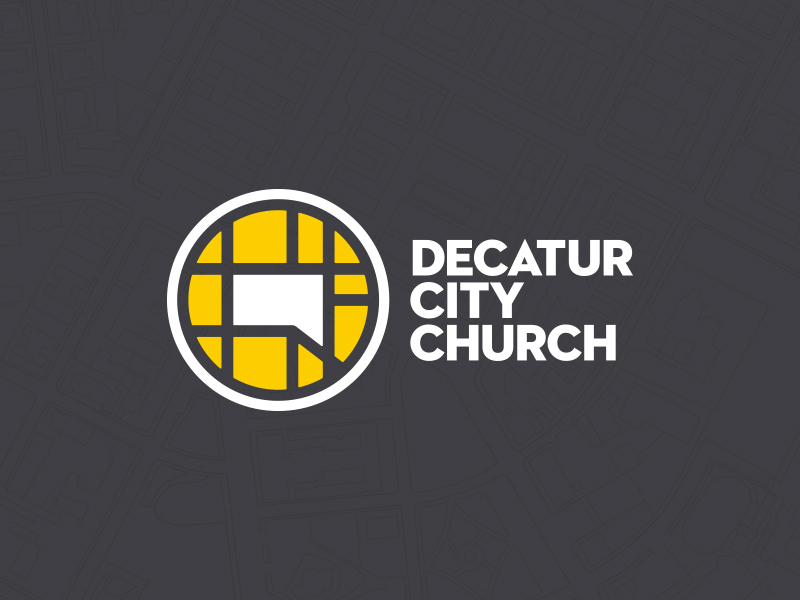
Decatur City Church has a striking logo that really caught our eye. The abstract map has a bold color scheme that draws you. It’s wonderful when your logo has a direct tie to who you are as an organization, especially if it ties into your geography that those seeing it will immediately recognize. Yellow as the accent color really pops. The white is also a great outline next to the black/charcoal.
Why We Love This Church Logo
We really like the geographical location tie-in. People love to have something they can personally relate to. We think this probably has great resonance with the local population. If you check out their website, you can also see that this really looks great on a T-shirt. Not a bad idea to think about when you are thinking of your church logo!
Trinity Presbyterian San Diego
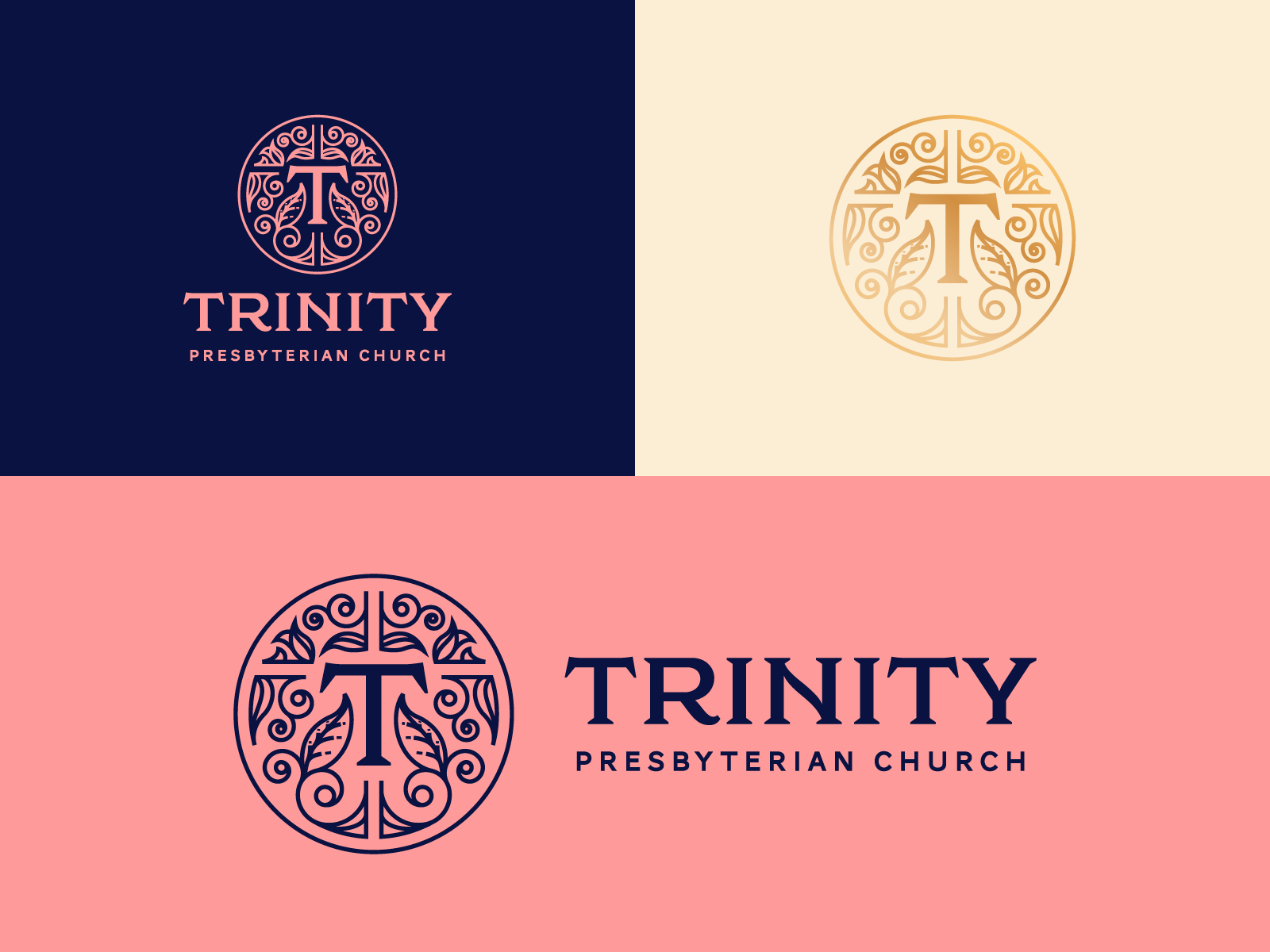
Trinity Presbyterian is a bit of a departure from some of the other church logo designs that we have been featuring. First off, color! Can I get an amen?!! The use of pink with the navy blue is a huge win. The contrast is really attractive to the eyes.
We also think that the use of pink is a way to make the detailed design of the circle with the leaves, etc., not look too fussy or outdated. The ornate nature of the logo is juxtaposed with the bold “T” and equally bold “Trinity”.
Why We Love This Church Logo
This logo seems to communicate a church that embraces the past and is also looking to the future. The font is simple, but the serif font still gives a nod to the heritage of the Presbyterian church. Like we touched on earlier, the pink is a great use of bold color and a way to communicate “We are not stuffy!” We love the bold decision. The artwork within the circle design is well thought out and beautiful.
Park Community Church
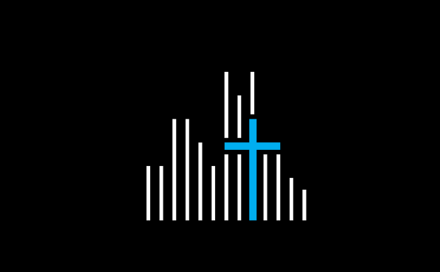
If you poke around the Park Community Church website, you’ll see that this is a church in the middle of a city made up of independent churches and ministries. How do you signify this in just a logo? Well, Park Community found a way! Even without text, the logo speaks for itself: this is the heart of Christ (a highlighted cross) in the middle of a city (lines of differing heights representing buildings).
Why We Love This Church Logo
Like a lot of other logos on this list, Park Community has made a logo that represents its church really well. They took the core of its identity and translated that into a clean, modern image with no letters or symbols outside of the highlighted cross. It also gets the “feel” of the church across. I think everyone would agree that this logo feels a lot more “urban” than it does “rural”. Try to make your logo “feel” like your church as well!
The Crossing

The Crossing is such a cool church name, but that’s not why we’re here. We’re here because this logo is absolutely awesome! We talk a lot about simplicity and sleekness on this list, and this logo fits in there with the best of the best. It’s modern and cool, and very inviting to younger people. Of course, the logo design itself is brilliant. It shows a bridge over a river, a literal “crossing”, but also uses both lines to make a cross, which represents a Christian church. Put it together, and this logo clearly represents “The Crossing Church”.
Why We Love This Church Logo
Simplicity and transferability are huge here. It’s already in black-and-white, making it great for printers, and can be shown in different sizes, since it’s simple enough that no detail gets lost when it gets small. It also fits in a square size with equal lengths on all sides, which can be really nice for formatting when using the logo on a website or on a worksheet.
Antioch Church
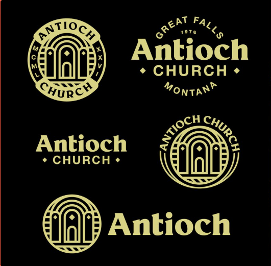
The logo for Antioch Church in Great Falls, Montana, is clean, classic, and versatile. This is a special logo because it is inspired by the real church in Antioch, Greece, from the book of Acts. The three arches look exactly like the three arches in the historic building.
The use of gold on black feels elegant and sophisticated, giving the logo a sense of reverence and importance. Its flexibility across different styles—circular, stacked, or standalone—makes it suitable for a variety of applications, from signage to social media. This design captures a perfect balance of tradition and modern appeal.
Rush Creek Church
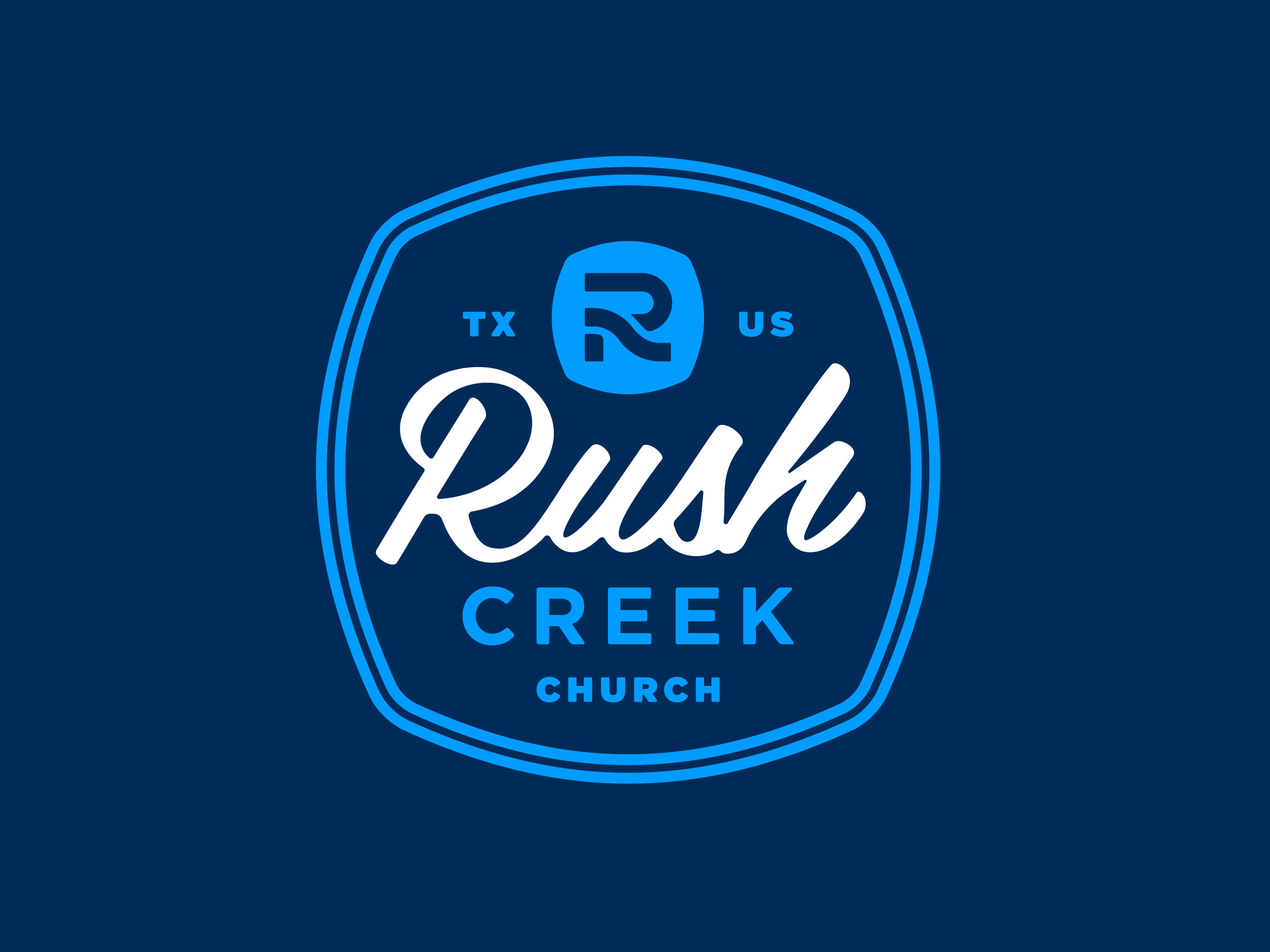
Rush Creek Church shows off for us in a few different ways. At first glance, you see a bold blue. Upon closer inspection, you realize that the “R” is, in fact, the “rushing creek”. This is a great use of shape. The logo is further laid out with a light electric blue to enhance the deeper color and underscore the overall design. When coupled with the white color, there is a deeper resonance than simply using blue and white.
Why We Love This Church Logo
We love it when form and function meet. Rush Creek Church was able to accomplish this by the form or design being beautiful, but also giving us further insight into who this church is. They are able to share information about their location hidden within the design. It also causes you to think of movement, which is always a good thing for a church. Never standing still or stagnant, but on the move!
We also love the almost badge-like shape of the logo. It somewhat looks like an awesome boy/girl Scouts badge that you want to sew on to your vest. Pretty cool.
Vineyard Cincinnati
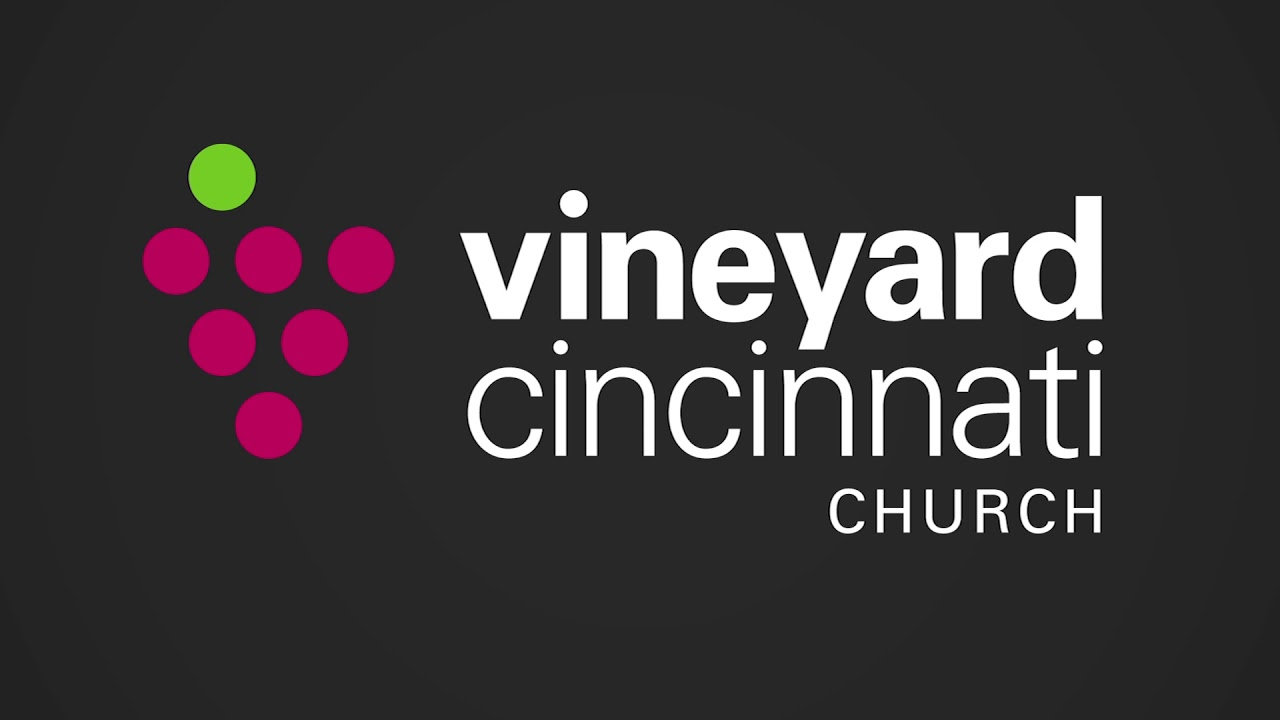
Rounding out our list of 15 best church logos is Vineyard Cincinnati. They have managed to take an often very cheesily done bunch of grapes into a modern statement. They even have the grape stem off-center instead of the obvious choice of centered over the bunch of grapes. This is very on point with their branding as well. It identifies who they are and the movement of churches they are a part of, but still gives them a distinct look.
Why We Love This Church Logo
We love the modern take on the artwork portion of this logo. The simplicity and lack of fussiness are really a breath of fresh air. This is highly transferable. From a giving page to a kids page, this logo is usable. In addition, we think that the artwork could be used alone on many things inside the church where the name is not necessary. Finally, we love the use of color within the artwork. Great job, Vineyard Cincinnati!
Frequently Asked Questions

Which Church Logos Do You Love?

That does it for our top church logos list of 2026. We hope that you were able to get inspired and instructed to create your next church logo! We encourage you to draw ideas from this list to make something as awesome and memorable as these ones.
Remember: a great church logo is more than just a symbol—it’s a reflection of your faith and values. A well-designed logo can help your church connect with more people, build trust, and create a lasting impression. Whether you choose to design it yourself using a church logo maker or work with a professional, make sure the logo speaks to your church’s mission and community.
It’s important for your logo to be simple, recognizable, and versatile. You can even find free tools online to get started. A strong logo can also provide a sense of security, ensuring that your church’s image remains consistent and professional across all platforms. No matter your approach, a great logo will help your church stand out and grow, guiding people to your message and making them feel welcomed and valued.
Do you have a favorite church logo that we missed? Let us know in the comments below.
God bless!