What is the best church font? What typefaces are going to represent your ministry the best? While there is no obvious answer for those questions, in this article, we hope to provide you with some tips and resources to help your church find the right fonts for its writing.
We’re going to explore everything you need to know about fonts and why choosing a font for your church even matters. We’re also going to explore tips and tricks to help you choose the right church fonts for all of the copy you’ll be writing.
Ready to dive into the world of fonts? Let’s go.
Fonts: Everything You Need to Know

Before we get into the methods you can use for choosing the right font for your church, let’s actually explore fonts themselves. It is important to gain an understanding of what fonts are and what they’re used for so that you can make the right choice when it comes to choosing a font.
What is a Font?
A font is a set of characters, including letters, numbers, punctuation, and symbols, designed in a specific style and size. Each font has a unique appearance that contributes to the overall visual appeal and readability of text in various media.
Fonts are essential in both digital and print graphics, providing consistency and personality to a design. They come in multiple weights, such as light, regular, bold, and extra-bold, allowing for versatility and emphasis within a text. This range of weights helps create a visual hierarchy, guiding the reader’s eye through the content.
Fonts are used in everything from websites and advertisements to books and signage, making them a crucial element in the field of graphic design. By selecting appropriate fonts and weights, designers can enhance communication and convey the desired tone and message effectively.
Fonts for Churches
Churches should care about having the right fonts for their branding because fonts play a crucial role in conveying the church’s identity, values, and message. The right fonts create a cohesive and professional appearance across all materials, from bulletins and websites to signage and social media posts. This consistency helps build a recognizable and trustworthy brand, making it easier for the community to connect with and remember the church.
Fonts influence the tone and perception of the church. For instance, modern fonts can convey a contemporary and welcoming atmosphere, while traditional fonts can reflect a sense of history and reverence. By choosing fonts that align with their mission and culture, churches can communicate their unique character effectively.
Moreover, readable and well-chosen fonts enhance the congregation’s experience by ensuring clarity in printed materials and digital content. This attention to detail shows care and respect for the audience, fostering a positive and inviting environment.
Think about how often you are writing copy for your church. The logo, the pamphlets you hand out every Sunday, your social media posts, the worksheets you provide during conferences. Not to mention worship slides that are displaying lyrics and even more! All of these use fonts, and so choosing a few fonts you use in your church can unify the visual aesthetic of all of your church’s branding.
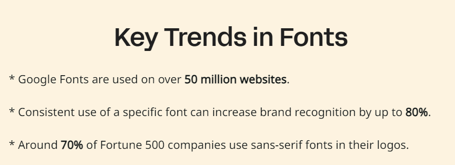
According to Linearity, consistent use of a specific font can increase brand recognition by 80%.

Now your church is not a business or brand, and you’re not trying to sell anything, but you do want your church to stand out and be recognizable. While a uniform font is far from the most important thing you can focus on, it is important in creating your branding.
Choosing the Right Font for You

Choosing the right font for your church is essential to create a welcoming and professional atmosphere that aligns with your church’s identity. The right font can enhance readability, convey the right tone, and ensure consistency across all materials. Here’s how to choose the perfect font:
Start by exploring free fonts available on Google Fonts. Google Fonts offers a vast collection of fonts that are easy to integrate into both print and digital materials. These fonts are versatile and can be used across various platforms, ensuring a cohesive look. Another excellent resource is Adobe Fonts, which offers high-quality typefaces for those with Adobe Creative Cloud subscriptions. These fonts can add a professional touch to your church’s branding materials.
When selecting a font, consider the tone you want to convey. A bold font can be effective for headings and emphasis, drawing attention to important information. For body text, opt for a more readable and less obtrusive font. Balancing bold fonts with regular or light weights can create a clear visual hierarchy, guiding the reader’s eye through the content smoothly.
Free fonts and other fonts found through various online resources can also be beneficial. However, ensure they are high-quality and appropriate for your church’s branding. Look for fonts that offer multiple weights and styles to provide flexibility in design.
Lastly, consistency is key. Choose fonts that complement each other and maintain a uniform look across all church materials, including worship slides, bulletins, websites, and social media. By thoughtfully selecting and using the right fonts, your church can create an inviting, clear, and professional brand that resonates with your congregation and community.
Here’s an awesome graphic from Cartridge Discount that gives you tons of tips on choosing the right font!

Church Fonts
And there you have it! Everything you need to know about choosing the right fonts for your church. In conclusion, choosing the right font for your church is a critical aspect of effective communication and branding. Leveraging resources like Google Fonts, Adobe Fonts, and other free fonts ensures a wide selection to match your church’s unique identity.
Balancing readability with style through multiple weights, including bold fonts for emphasis, creates a visually appealing and engaging experience. Consistency across all materials, from worship slides to bulletins, reinforces your church’s message and fosters a welcoming atmosphere. Thoughtful font selection ultimately enhances your church’s ability to connect with and inspire your congregation and community.
What fonts do you use for your projects? Let us know in the comments below.
More Resources on Design
- How To Makeover Your Church’s Website In A Day
- Common Church Graphics Mistakes And How To Avoid Them
- A Mobile Friendly Church Website Is No Longer Optional
- Should Your Church’s Ministries Have Separate Social Media Profiles?
- 11 Must-Know Church Website Trends for 2024: Creating an Engaging Online Presence
