We don't do projections. We do receipts.
Before-and-after numbers from real churches. Web design, local SEO, Google Ad Grants — here's exactly what happened after they said yes.
$0 in ads to $26K+ free, and the #1 spot on Google
"Thanks to their work, we have been able to maximize our Google Grant and invest over $26,000 in Google Ads, which has driven over 4,000 new visitors to our website. We now rank in the top 15 for our city and are the #1 result for Lutheran Churches in our area!"
Mark Wuggazer, St. John Church
| Before | After | |
|---|---|---|
| Google Ad Spend | $0 | $26,000+ |
| New Website Visitors | Minimal | 4,000+ |
| Listing Citations | 0 | 150+ |
| Local Search Ranking | Not ranked | #1 Lutheran Church |
New website launched. Applications doubled in 30 days.
"We have seen a pretty dramatic rise in applications since the new website launched. In just under a month, we have received 32 applications for our entry level programs and 45 apps total. This is a 113% increase compared to the same period of time last year."
Paul Allen, YWAM Madison
| Before | After | |
|---|---|---|
| Total Applications (one month) | ~21 | 45 |
| Entry-Level Applications | ~15 | 32 |
| Increase | — | 113% |
5 visitors a month became 30 in three weeks
"We used to get like 5 new people a month, check out the last 3 weeks — Week 1: 5 new people, Week 2: 10 new people, Week 3: 12 new people. So in the last 3 weeks we have had nearly 30 new people!"
Ryan Keller
| Before | After | |
|---|---|---|
| New Visitors per Month | ~5 | 27 in 3 weeks |
| Growth Trend | Flat | Accelerating week over week |
Hit play. Let them tell you themselves.
Wondering about a specific service? Here's the proof.
"New visitors and members have let us know that the website was a significant reason they decided to give us a try!"
Laura Hawkings
Christ Our Shepherd Church
"I can't tell you the headaches we had with the previous company. You have been a breeze to work with, and the back-end is easy to use making updates a simple task."
Beth Bodeman
Yorktown Vineyard
"The team did a fantastic job with the design of the site and made it look so beautiful and professional. I HIGHLY recommend REACHRIGHT to all churches."
Greg Scott
Waikoloa Community Church
"46,982 more people saw our ads last month. 2,727 more people clicked on our ads. $7,471 more in grant money. 946 more people converted. Not only are we getting so much more with the grant than before, but you're also saving us more than $300 per month!"
Michelle Rux
"We are consistently seeing first-time guests on Sundays, and when we ask, “How did you find us?” the response is almost always, “We found you online.”"
Terry Kreuger
Redemption City Church
"The team was EXCELLENT. They communicated well, their response was very timely, and they always provided the information needed. I have worked as a technology manager for many years, and this was a great experience."
Rick Wood
Pursuit Christian Fellowship
See the websites behind these results.
Every site was designed and built by our team. Real churches. Real results.
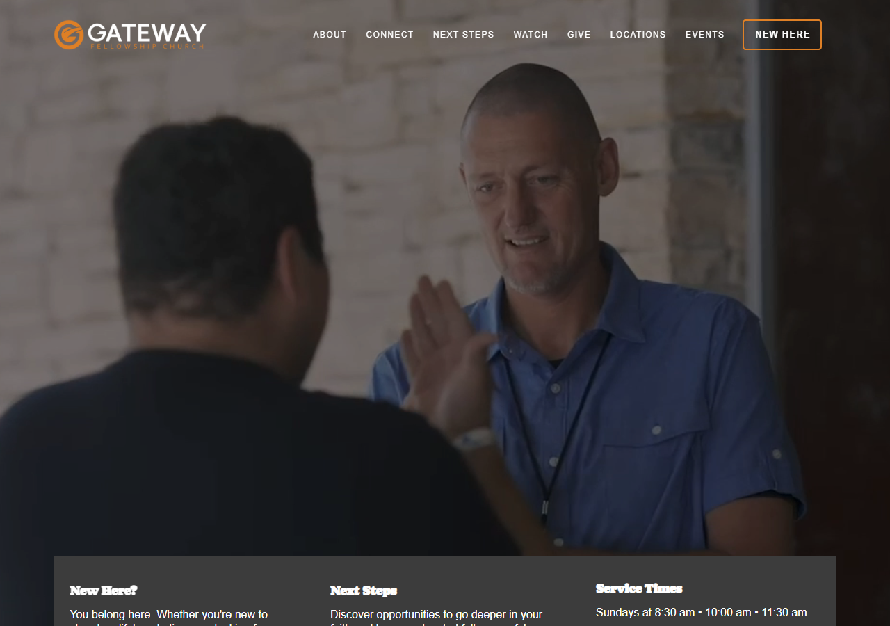
A multi-service church with 11 campuses helping friends become devoted followers of Jesus.
See the full projectGateway Fellowship Church
Custom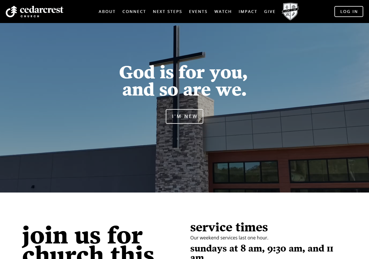
A growing suburban Atlanta congregation built on Encounter, Disciple, Serve, Impact.
See the full projectCedarcrest Church
Custom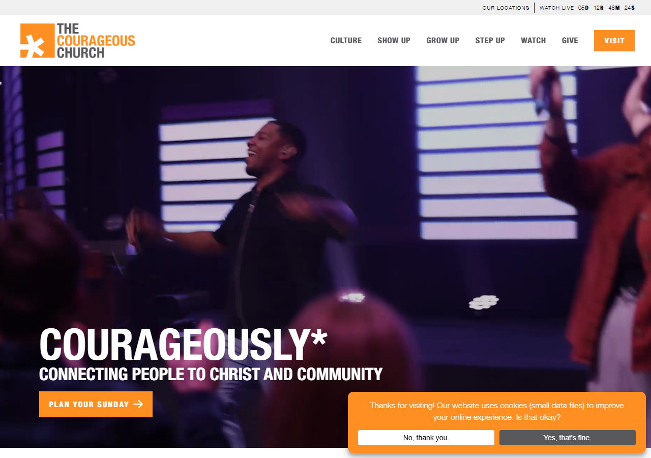
A high-energy, multi-campus church built around Show Up, Grow Up, Step Up.
See the full projectThe Courageous Church
Custom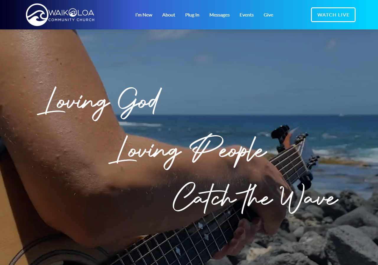
A multi-generational ohana on the Big Island. Loving God, Loving People, Catch The Wave.
See the full projectWaikoloa Community Church
Tailored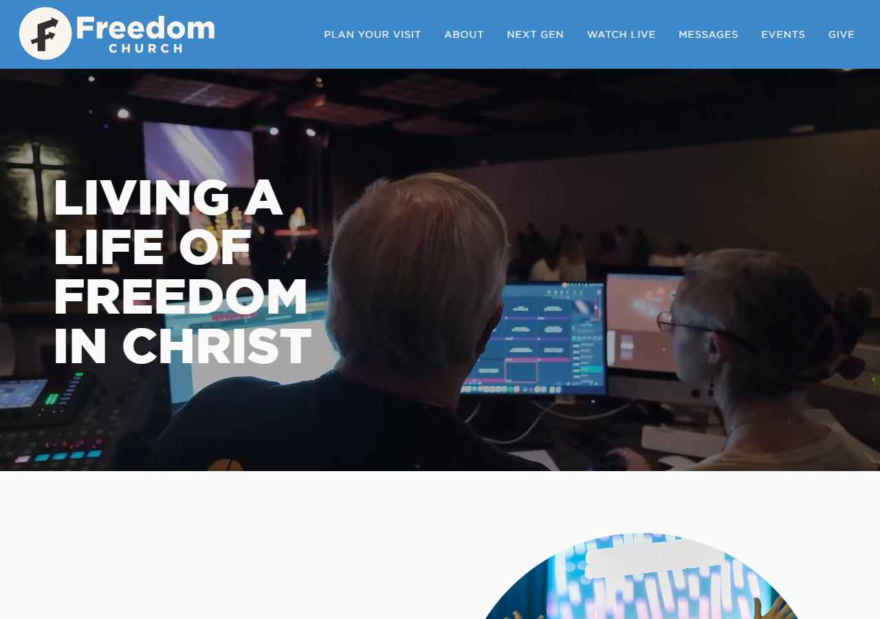
A life-giving church where people know God, find freedom, discover purpose, and make an impact.
See the full projectFreedom Church
Tailored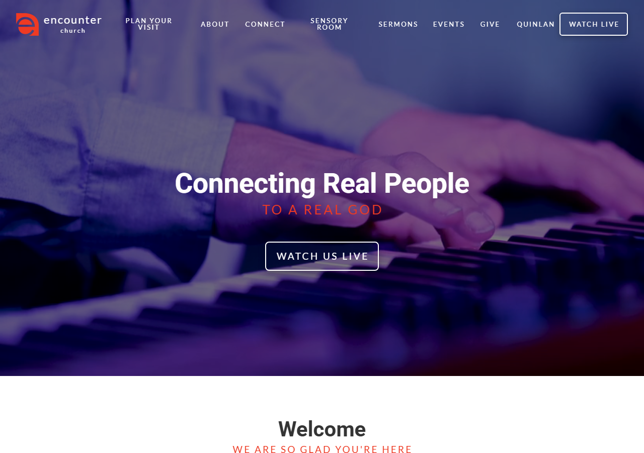
A multi-campus church connecting real people to a real God, with a dedicated sensory room for accessibility.
See the full projectEncounter Church
TailoredEvery result above started the same way.
A 30-minute call. We look at your website, your Google presence, and your current traffic — then tell you exactly what's working, what's not, and what to fix first.
That call is free. No pitch deck. No contracts. Just a clear picture of where you stand and what's possible.
