When determining what should be on your church’s website, there is a lot to consider. How much is too much? What aspects are the most important? Should we include past sermons online?
It’s up to you when creating your church website all that should be included, but there are certainly a few key things that are a must. After all, the purpose of your church website is to provide information and clear direction to people joining your church.
Have you ever been on a website and couldn’t find the information you needed? It can be really frustrating when a website isn’t clear or doesn’t have all the necessary information.
You’ll also want to make sure that your website stays up-to-date with events and any other new additions to the site.
A church website has endless possibilities and endless ways to be creative, so let’s find out what important information you should include.
Estimated reading time: 13 minutes
Table of contents
What Makes a Good Church Website?
To have a great church website, there are a few things to consider first.
Your website should be a direct reflection of the culture of your church. Do you value getting people plugged in? Do you want to focus on small groups and the importance of being connected? Is the kid’s ministry the focus of your growing church?
A website that has a clear and concise mission will always be successful.
Nowadays, almost every church has a website. So you’ll want to distinguish yourself from other sites. You shouldn’t feel the need to compete with other church websites, because we all have the same goal: to bring people into the house of God.
Check out our comprehensive list of 100 of the best church websites of 2023!
What is the goal of a church website?
First, think about why people are visiting your church’s website. Oftentimes, people are looking for information. Perhaps that’s the location of your campus or service times for a Sunday morning.
Other times, people may be looking to give or sign up for any upcoming events online. Having a well-organized church website is not only helpful to new members but for long-time attendees as well.
Top 14 Must-Haves for your church website
There are so many components that go into making a wonderful church website, so let’s start by breaking it down into sections or different pages that would be beneficial to include!
Home Page
This is pretty self-explanatory. Your home page is the first page a guest sees when they enter your website. Here you might have your mission statement displayed, or perhaps a quote from a recent sermon.
Your home page acts as a guide to where all the other pages will live. It is essentially the host of all the important information and its the first impression that your church will make on potential visitors.
Location
Having your location front and center is extremely important. There are many churches that have the same name, so make sure to have your city and state (or country) shown very clearly.
It’s also highly recommended to have a section on your website that has a Google Maps or Apple Maps link to your church’s location.
Service Times
Another very important element is the service times. This can even be listed alongside the location of your church. Service times might be one of the most important pages to have on your website. When guests are looking up your website, chances are they’re searching for a time to come and visit you.
Plan a Visit Page
Include a welcome video from the pastor that talks about important information. This doesn’t have to be a very long or in-depth video, but something quick explaining what to expect on a regular Sunday morning. This could include mentioning how long a typical service time runs, or how early you should arrive to find a seat. You may also include information about any free coffee or other amenities a guest might want to know.
About Page (Belief and Mission)
This page is a great opportunity to explain how your church was founded and the history behind it. Each church has a unique story, so take this time to tell it.
Be creative and make a video about the history and beginnings of your church. While guests can read about the information, it’s always nice to watch the senior pastors talk about the heart behind the church.
Sermons
Another reason people may be visiting your website is to watch past sermons. Create a page that includes past sermons that are organized by date and sermon series. Sometimes people can’t always make it to church in person, so let’s give them a chance to watch church online!
Livestream

Another great addition to technology is the ability to live stream services. Whether you are able to live stream directly from your church website or you have a link that takes you to YouTube, make sure you display an area on your site for live streaming. Online church made waves during the pandemic in 2020 and a lot of people still prefer to tune in via a live stream.
Online Giving
Gone are the days when people would submit paper checks into the offering bucket. Online giving has made it much more accessible to give. A large percentage of people in the church now give solely online through an app or on a website. It’s much easier to set up a direct deposit for all online giving opportunities.
Get Involved
For any new guests that are visiting your church, they may be seeking to get involved. Many churches have next step programs that talk about the history of the church and all next steps for getting involved and serving on teams.
Staff and Leadership
Highlight your staff and leadership teams with a dedicated page! This is a great page to talk about all the important people that work so hard to make church great day in and day out. Break it up into the different departments that make up your staff and let them each write a small bio about what they bring to the church.
Events
If your church hosts conferences such as a women’s conference or a kid’s or student conference, having a page dedicated to these events is essential. Highlight each event and include any highlight pictures or videos from past conferences. This is where you should include registration links for people to sign up and join at the next one!
Not only is this a great page for conference registrations, but for any upcoming events in the future at your church. You might have special summer events upcoming, so include dates and any other information.
Another great idea to put under the Events page is Parent-Child Dedication sign-ups and Baptism sign-ups. These are both important events in a person’s life and it’s great to be able to provide dates for when those special days are happening.
Books/Teachings
Do you have other great preachers and speakers you love to highlight? Create a section on your website that links to these books and resources. It’s always helpful to have a place that provides great resources, or even have links to books people in your church have written.
Ministry Specific Pages

This is where you should include all your ministries, from women, men, kids, and special serving opportunities. Highlight each ministry with welcome videos and pictures. Your community is made up of so many different kinds of people, so make sure to highlight the wide range you hope to see get connected.
Under the kid’s section, highlight every age range your church caters to, from nursery age to college students. Parents want to know that their children will be learning about God and well taken care of. Kids are important and so make sure to give confidence to the parents.
If your church has any outreach groups for people to have volunteer opportunities, highlight that on the ministry-specific page. List contact information for people to reach out to ministry leaders so they can get dates and times for upcoming serving times.
Contact Information
This can be a bottom section on your website that is there on every page. Important contact information to include here again could be the location, phone number, and email for anyone who needs to get in contact. By providing a phone number, guests can easily reach out and ask any questions they may need.
Additional:
Your website should include pictures scattered throughout, touching on each of the different ministries and events. A website that doesn’t have any visuals is not going to keep the attention of any online visitors for very long. Not only is the content important, but visually the website needs to be well thought out and creative!
Pictures – highlight pictures from past conferences or Sunday mornings
Videos/Testimonies – share moving testimonies from members of your church
Prayer Requests – allow people to submit prayer requests that get prayed over weekly
Social Media Links

It would be very beneficial to include links to your social media sites such as Instagram, Facebook and YouTube. This could be simply set up on your home page so people can find it quickly. Also feel free to include any other social media accounts you might have for specific locations or ministries such as a student Instagram page. Social media is typically updated quickly and will provide the most recent information.
Newsletter and Text Sign Up
There is always so much information to keep up with, so create a part of your website that allows guests to sign up to receive weekly emails and texts so they always stay in the know. They can simply put in their email address or phone number and be added to a contact list.
Start creating your church website

Thankfully, there are so many great websites that can help you start your journey of creating a great church website. There are experts who are available to talk with you and customize it to your exact needs.
A few great website builders include:
For more information about each of these websites, please refer to REACHRIGHT’S comprehensive list of amazing church website builders!
Examples of Great Church Websites
Celebration Church – Austin, TX
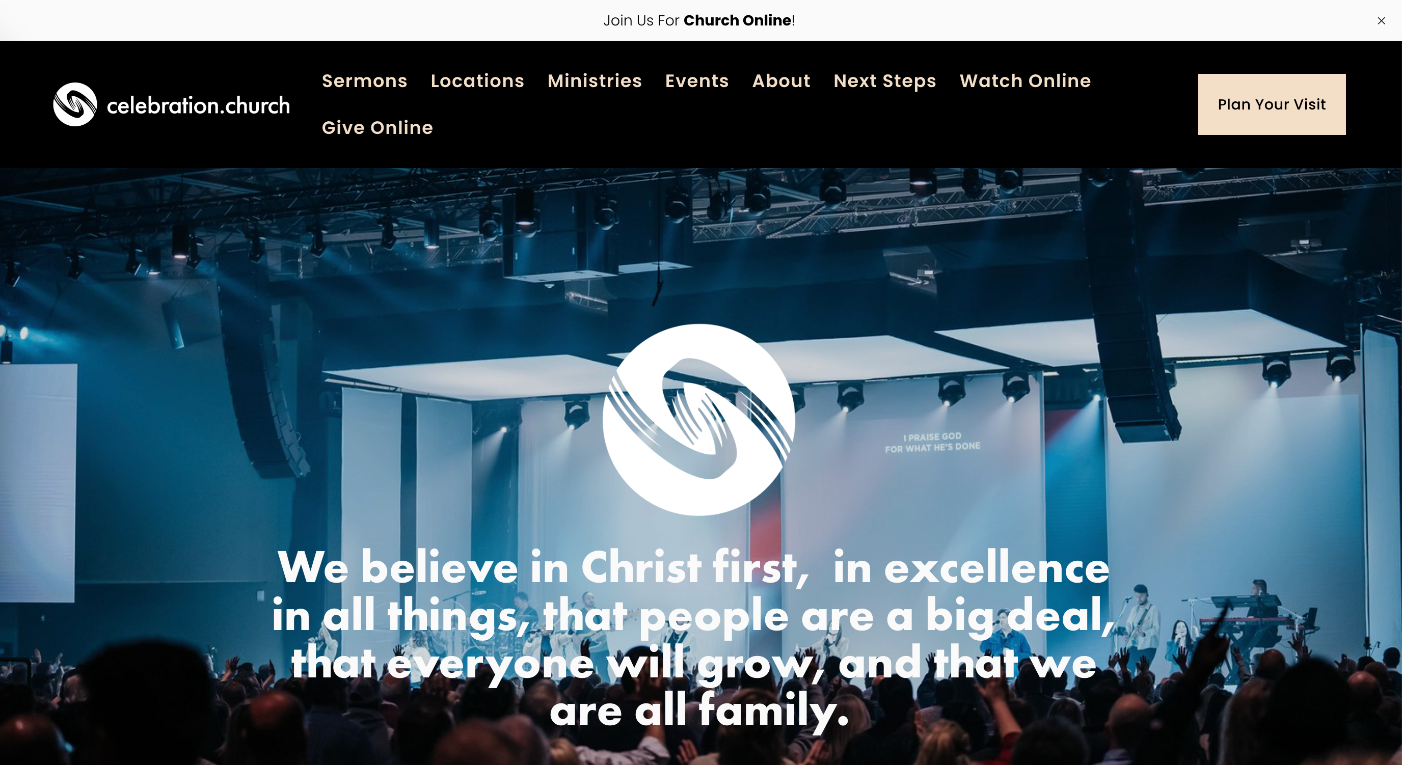
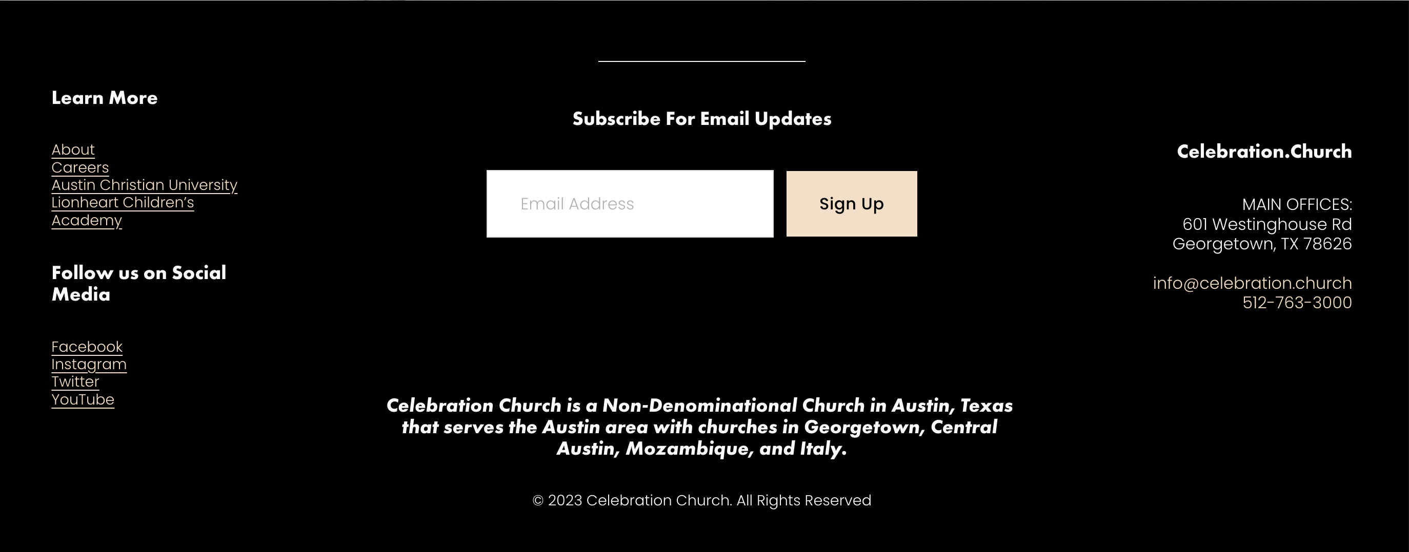
Celebration Church makes it home in Georgetown, Texas. Their website is visually engaging, highlighting pictures of their service and opens with their church logo as well as their mission statement. As you can see they have tabs at the top of the home page with links to additional information that you can easily find. At the bottom of each page, they include a place to sign up for emails, a contact page, location, phone number and socials.
NewSpring Church – South Carolina
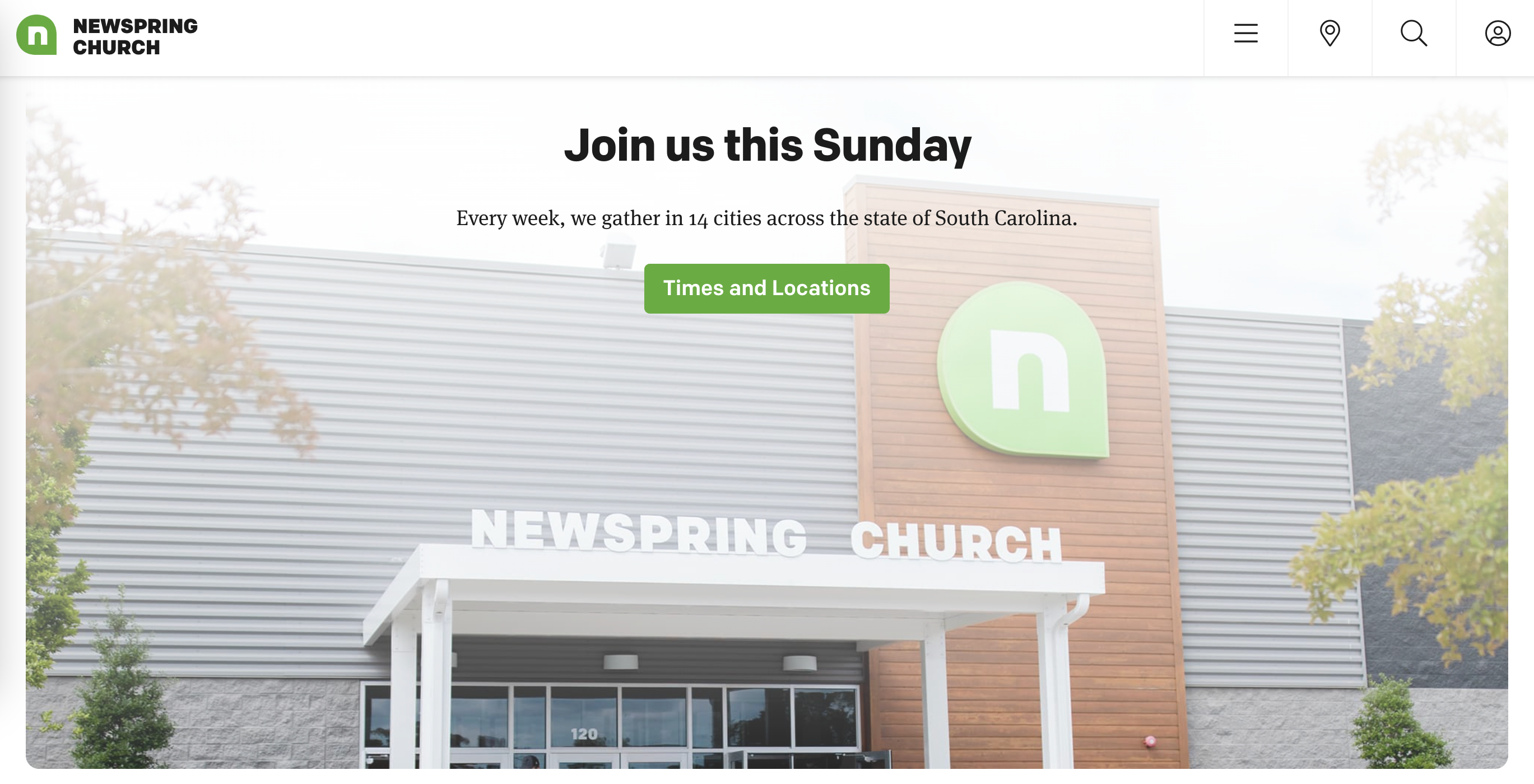
NewSpring Churchhas a really good website that draws you in from first glance. Immediately, on their front page, they mention their location, which is helpful when determining if there are locations near you. They also have a wonderful section that highlight short testimonies from members of their church.
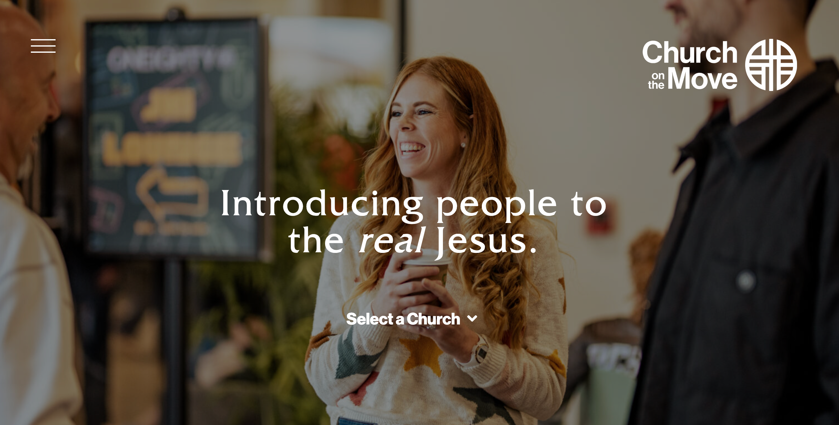
Church on the Move – Tulsa, Oklahoma
Church on the Move has great photography all throughout the front page which again, draws you in with vibrant colors. Their website is easy to navigate with their ministry pages, serving opportunities, past sermons and social media all on the home page. Their website is clean and simple.
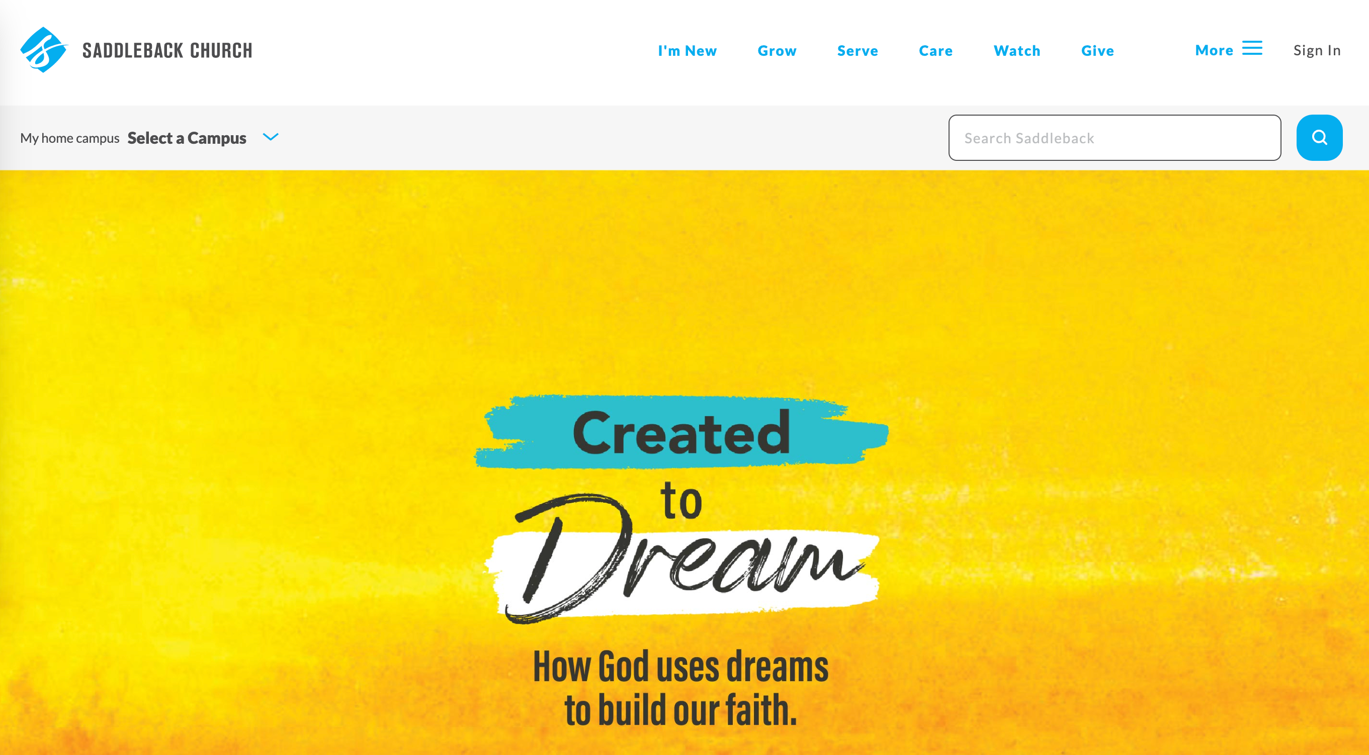
Saddleback Church – California
Saddleback Church has locations all over the world, but provide easy access to find the location nearest you to get all the information you will need. Upon first glance, their website is bold and creative. The tabs at the top of the page work as easy guides to find just what you’re looking for.
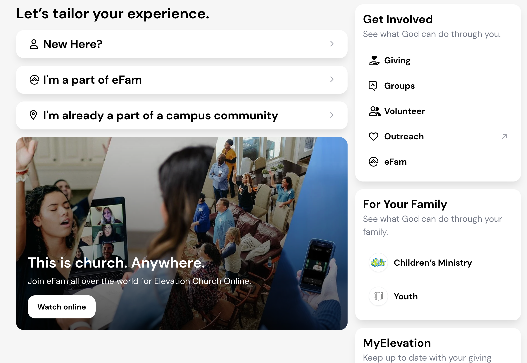
Elevation Church – North Carolina
Elevation Church has an amazing social media presence and their website follows a very clean and clear vision as well. As you enter their website, you can find their most recent sermons and as you scroll down, you can find quick links to get connected.
There are so many incredible church websites, that it would be impossible to list them all. Take some time and look at the websites of other churches near you to get inspired and see what they’ve done well.
Summary
Every church website is different, and yet they all contain the same key information listed above. Hopefully, you will have a lot of church website visitors who will feel your church is a great fit for them.
By having a good website, you have the potential to provide a new place of worship for people. Keep your website updated regularly and don’t forget to mention it on Sundays. Many people might not even know you have one!


