Every year, I review hundreds of church websites to find the ones that actually get it right. Not just the pretty ones. The ones that turn online visitors into Sunday morning guests.
Whether you’re building a new church website from scratch, looking for design inspiration, or wondering how much a church website costs, seeing real examples helps. You get a feel for what works, what doesn’t, and what your church can realistically pull off.
I’ve rounded up the 23 best church websites of 2026. These aren’t just award-winning church website designs. They’re sites that nail the fundamentals: clear navigation, fast load times, mobile-friendly layouts, and a first-time visitor experience that makes people want to show up on Sunday.
I update this list every few months. If you have a church site you think I should consider, let me know in the comments below.

Quick Reference: Best Church Websites by Category
Not all churches have the same needs. Here’s a quick breakdown of which sites on this list stand out for different church sizes and styles:
| Category | Churches | Why They Stand Out |
|---|---|---|
| Best for Small Churches | Fusion Christian, Be the Church, Transformation Church | Clean layouts that don’t require a big budget or large team to maintain |
| Best Modern Design | VOUS Church, Fairhaven, Real Life Church Sacramento | Cutting-edge aesthetics with video backgrounds and bold typography |
| Best for Mega/Multisite | Elevation Church, Saddleback, The Orchard | Handles multiple locations, large content libraries, and complex navigation |
| Best Minimalist | ONE Church, Crossing Church, Bedehuskirken | Stripped-down designs that prioritize clarity over flash |
| Best First-Time Visitor Experience | Cedarcrest, Hope on the Beach, BeLoved City Church | Clear “I’m New” pathways and visit-planning tools |
| Best Branding | Courageous Church, Bayhope, Valley Creek | Cohesive color schemes and visual identity throughout |
Before the full breakdown, two quick things: who I am, and what I’m grading these sites on.
Why Trust Me on This?
I’ve been a pastor for over 20 years. I led a Foursquare church in Madison, Wisconsin, from 30 people to 150. Today I’m executive pastor at New Hope Hawaii Kai, a church of about 300.
But here’s what makes my take on church websites different: I’ve been on the other side of the church website conversation for almost as long.
In the late 2000s, I was sales manager at Faith Highway (acquired by Ministry Brands in 2015), leading 15 reps who sold church websites and software to pastors full time. I sat on hundreds of demos. I heard exactly what made pastors say yes, what made them say no, and what they regretted six months after launch.
In 2016, I started REACHRIGHT. Church website design was our first product. For the first couple of years, it was the only product, and I was the lead designer building sites by hand. Today REACHRIGHT has 17 staff and a full design team, but I’m still personally involved in the design of some of our largest clients.
So I’ve seen church websites from four angles:
- As the pastor who needs the site to actually bring people through the door on Sunday.
- As the visitor scanning church homepages when my family is traveling and we need somewhere to worship.
- As the salesman who watched hundreds of pastors decide what to buy and why.
- As the designer who has built or rebuilt hundreds of church sites since 2016.
That’s the lens I bring to every site on this list.
How I Judge a Church Website
A beautiful church website that no one can find is just expensive wallpaper. So when I open a church homepage, I’m running through the same mental checklist I used when I was building my own church’s site, advising clients at Faith Highway, and shipping designs at REACHRIGHT. Here’s what I’m grading on:
- A clear path for a first-time visitor. A first-time guest should know where to click within 3 seconds. That means a visible “I’m New” or “Plan Your Visit” button somewhere obvious. The mistake I see most often: pastors design their site for the people who already attend. Members already know where they’re going. The site’s job is to convert the people who don’t.
- Service times and location above the fold. Don’t make people scroll or hunt through menus for this. It’s the #1 thing visitors look for. When I’m picking a church to visit on vacation, I want service times in the first 5 seconds. Every visitor wants the same thing.
- A site that actually works on a phone. Over 60% of church website traffic comes from mobile. Most pastors design for desktop because that’s where they’re sitting when they review the site. Wrong audience. Pull out your phone right now and look at your homepage. If it doesn’t look great on mobile, you’re losing visitors before they ever show up.
- Fast load times. Every second of delay costs you visitors. The best church websites I’ve measured load in under 3 seconds. Most of the slow ones have an oversized hero image and three autoplay videos competing on the homepage.
- Real photos of real people. Stock photos fool nobody. Visitors spot them in two seconds. Real photos of your congregation, your building, and your Sunday morning service build trust in a way no stock library ever will. If your photos look fake, your church will feel fake too.
- Strategic SEO and local keywords. A gorgeous website that doesn’t show up on Google won’t reach the people searching for a church in your area. I’m watching for whether the site mentions its city, its neighborhood, and what kind of church it is. The best sites on this list surface when someone searches “church near me” at 9pm on a Saturday night.
- Storytelling that says who you are. Within 30 seconds, I should be able to answer two questions: What does this church believe? And would I feel welcome here? The sites that nail this use real stories, real video, and real specifics. The ones that miss it lean on vague phrases like “authentic community” or “doing life together” that mean nothing to a stranger.
Every church on this list nails at least five of these seven, or does one of them so well it makes up for the rest. As you browse, pay attention to which moves could work for your church.
If you want help with your own site, explore our web design services, or check out the best church website builders if you prefer DIY.
The 23 Best Church Websites of 2026
Here are the best church website designs I’ve found this year. Each one earns its spot by excelling in design, user experience, or first-time visitor conversion. I’ve tagged each with what makes it stand out.
1. Cedarcrest Church
Best for: First-time visitor experience
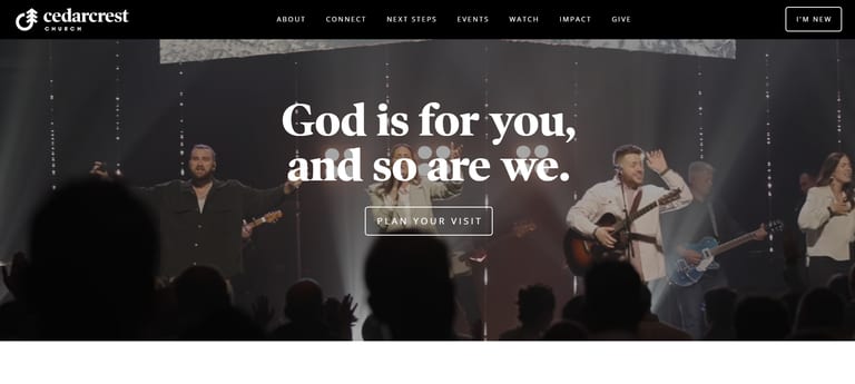
Cedarcrest Church has a great logo and nails the first-time visitor pathway. A highlighted “I’m New” button sits in the top right corner, and a “Plan Your Visit” call to action is front and center on the homepage.
The main menu has everything you need clearly laid out, including next steps, events, services to watch, impact, and giving. Cedarcrest stays away from complicated submenus and instead links to landing pages with clearly laid out information.
Scrolling down the homepage also gives you an idea of how you might want to get involved in this church. Kids and student information is prominent. The homepage tells the story of the church’s vision and values in a short blurb.
The Cedarcrest website has dynamic filmography, clear buttons, crisp photos, and an efficient design to get new visitors engaged.
2. VOUS Church
Best for: Modern design that appeals to young adults
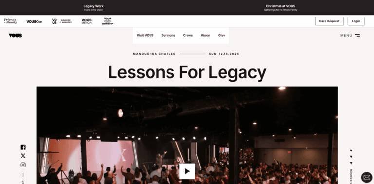
VOUS Church is one of the most referenced church websites in the industry. When people ask me for help designing their website, they often cite VOUS as the inspiration they’re aiming for.
Scrolling through their home page is a treat. It’s designed with an incredible modern aesthetic that especially appeals to young people.
The silent video of a recent worship service autoplays upon entering the website. It’s not intrusive, but it grabs your attention. Right underneath, all church locations are laid out with service times and exact addresses, so there’s no guesswork left for visitors.
I love their look, and I see why they’re so popular.
3. Fairhaven Church
Best for: Cutting-edge design and animation

“So Everyone Can Find Hope”. I mean, c’mon, that’s some good stuff.
Great minimal design, pretty colors, great animations, and icons. This is easily one of the most technologically advanced church websites on this list. It utilizes some next-level website design tools, and that’s really great to see.
If anything, the website is almost too minimal. The front page could do with some extra info and help for new site visitors. I like how instead of overwhelming someone with a ton of other page titles at the top of the website, they have kept it all inside the two bars on the top right button, to be revealed when clicked.
Also, do you see that cool jean-jacket guy on the front page? Well, the website actually has a rotating list of portraits whenever you open the website. Try refreshing a few times, and you’ll see all the different options. This is unnecessary and extra, but pretty neat.
4. Real Life Church Sacramento
Best for: Video storytelling and modern aesthetic
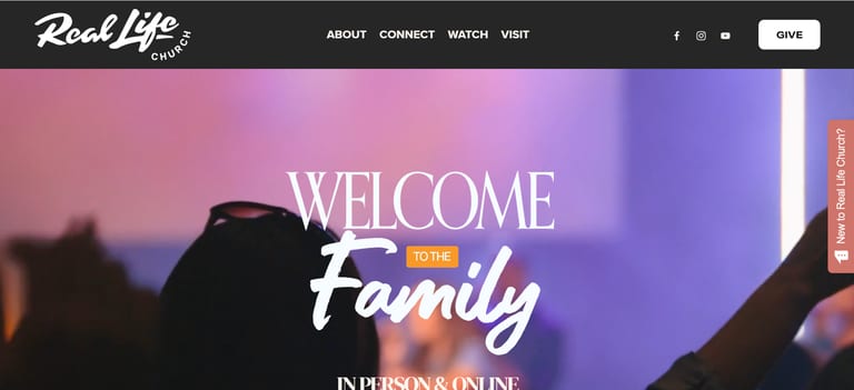
Real Life Church (RLC) in Sacramento, California, has a very modern and sleek design. The website caters to younger audiences in the way it is presented. It looks cool and hip and is the kind of place a young person wants to be. Video footage behind the opening text also shows the church’s dynamic worship services, church members, and events.
I found this design element to be an effective way to show a short montage of those specific areas of the church. This is a great way for a potential visitor to better see what the church feels like instead of just in a still photo. Hiring a videographer and professional photographer can be a game-changer when it comes to custom website design.
Scrolling through the website is just an aesthetic delight. The fonts, colors, and layout are all very cool to look at, and they all present information in a clean and clear way. The website is also updated regularly with new sermon clips, new upcoming events, and more.
5. Transformation Church
Best for: Small churches with clear messaging
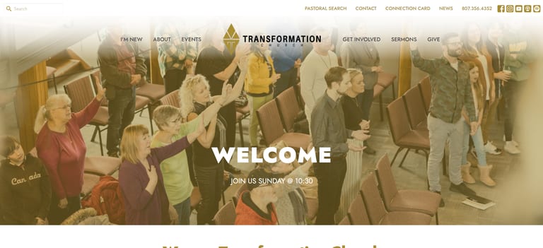
https://transformationchurchtbay.com
This church website couldn’t be clearer: “Welcome” and “Join Us Sundays @ 10:30”. It’s such a great call to action and really in line with what the church is all about. They have a unique yellow, black, and white color scheme, which you don’t see often as well.
Once you scroll down, you see three awesome buttons: “I’m New”, “Join a Life Group”, “Latest Sermons”. These are great because they cover a lot of bases regarding questions or concerns a new visitor may have.
They just give out a ton of information in a way that’s clear and also free. Free sermons, free resources, free info to get connected or to visit. It’s generous but not overwhelming, and it’s all communicated in a few words, not a few paragraphs.
You may also notice a search bar in the top left corner. Transformation isn’t the only church that does this, but a search bar can be helpful for people searching for specific things. Sometimes navigating through menus can be time-consuming, so a search bar can help.
6. Fusion Christian Church
Best for: Small church websites on a budget
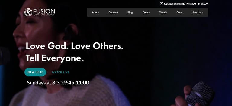
https://fusionchristianchurch.com
What a solid opener, huh? “Love God. Love Others. Tell Everyone”.
Underneath that, they have a stand-out blue button if you are a new visitor, and a less-noticeable button for people to watch live. Then they have their service times laid out plain and simple.
Next up, you’ve got a nice section all about the church and what they’re about, flanked by pictures of smiling church members doing church things. It’s inviting and clear and helps to showcase the church’s passion.
You may notice the main landing page isn’t that long. It displays all the important stuff and then comes to an end. It also has a cool feature at the bottom where it displays the church’s position in Google Maps to give potential visitors a clear look at where it sits in the city.
7. The Orchard
Best for: Multisite churches with multiple locations
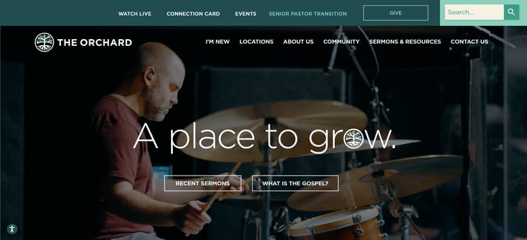
The name of The Orchard church also ties into the mission and messaging. Their headline says, “A place to grow” and uses the logo as the “o” which is pretty neat.
Their six locations are clearly laid out on the homepage with addresses, directions, and service times. As I’ve said many times, having this info consistent and prominent is vital for local SEO.
This site also features a great range of authentic pictures. You can tell exactly what the church will look like if you visit. Furthermore, if you visited The Orchard website this past December, you were immediately greeted with a pop-up for a Christmas Devotional. Although most churches emphasize coming for a visit, providing a resource like this immediately serves your visitor without asking for anything in return.
8. Hope on the Beach Church
Best for: “Plan Your Visit” conversion
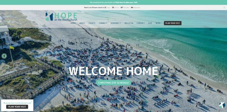
https://www.hopeonthebeach.com/
“Welcome Home.”
That line over a beautiful image of their beach service? That’s what I call good marketing.
This website’s got it all. I especially like the focus on the “Plan Your Visit” option. There are multiple calls to action for visitors to get started planning their visit, which is always effective at transforming website visitors into church visitors.
By scrolling for just a few seconds, you get what they’re all about. They feature their community involvement, a focus on spiritual growth, and their love for Jesus Christ. What a cool website!
9. Elevation Church
Best for: Large churches with sermon-first strategy
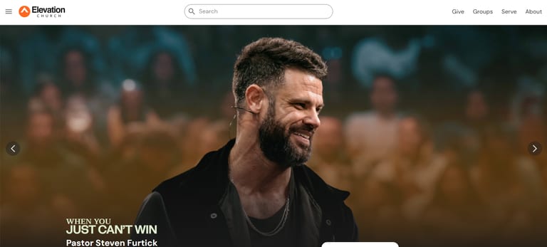
https://www.elevationchurch.org
Even though Elevation Church has the advantage of being a recognizable name in Christian culture, they don’t let their reputation lead the way. They still put in effort to make an appealing and powerful website.
Their sermons are first in the navigation menu which is rare. I liked this because a website visitor can quickly listen to online messages and see what the church ‘sounds like’ on a Sunday message. In addition, I love their large call-to-action buttons because you can’t miss them!
Lower down, they have two big sections: “Discover more ways to connect” and “A place for you and your family”. These are appealing ways to draw visitors in and give them more information. Each section has a few buttons, words, and images that don’t bombard anyone with too much visual clutter.
10. Valley Creek Church
Best for: Strong branding with ministry-specific pages
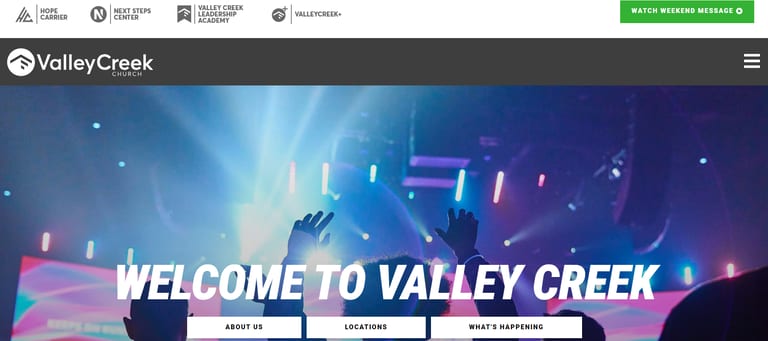
Bold colors and large graphics make this site visually appealing. Valley Creek’s website uses large graphic icons for each of its ministries. This helps to separate the different areas of ministry, but also keeps a consistent look to the site. And green is often a color most associated with natural or a natural connection, an inspiration that supports the organic and down-to-earth message of this church.
I liked how they had their worship songs and lyrics available on the site. You can download the music pages and download the songs directly from iTunes. How convenient!
They use the CTA’s well, and a site visitor can easily sign up to join groups, join a serving team, and even audition for the worship team directly using those links.
11. The Courageous Church
Best for: Cohesive branding and visual identity
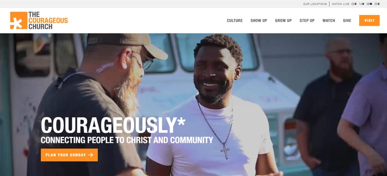
Courageous Church has a great asterisk motif throughout and only uses three colors: orange, white, and black. Visually, this gives uniformity to the website. It feels cohesive, clean, and pleasing to look at.
The video montage playing in the background of the initial landing page is also perfect. It’s not only filmed professionally, but it also covers a multitude of aspects of church life: worship, sermons, baptisms, family events, and more. It’s basically saying, “This is what life at this church looks like.”
Website visitors always want to know if the church they’re looking at is right for them. Well, the first thing you see when you scroll down is a section on the church’s mission statement and then a video of their latest sermon. What better way to see if the church is right for you?
And don’t forget the powerful call to action buttons throughout, telling people to plan a visit. They are bright, bold orange buttons to stand out and attract attention.
12. Saddleback Church
Best for: Mega church with clean, minimalist approach
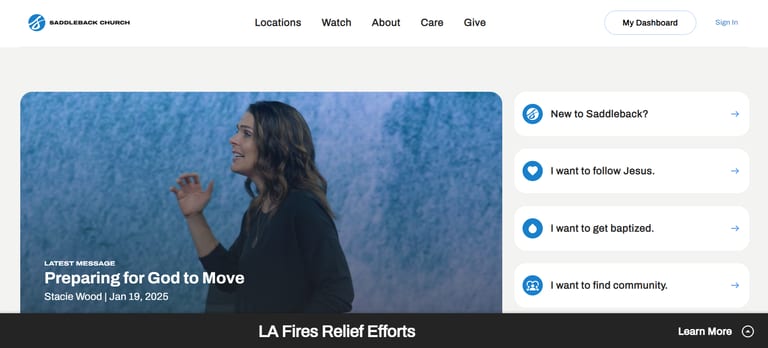
https://welcome.saddleback.com
What a clean and visually appealing design. I love the commitment to the two main colors of blue and white, as well as the small icons they use to differentiate sections.
The first thing you are presented with is the latest message, which you can watch immediately by pressing a button. It starts playing on mute once you enter the website, and that motion helps to grab your attention.
The rest of the page is minimalistic and clean. If you check out the other pages, like the “New to Saddleback” page, you’ll find crisp photography, clear calls-to-action, and a digestible layout.
13. BeLoved City Church
Best for: Welcome page that answers every visitor question
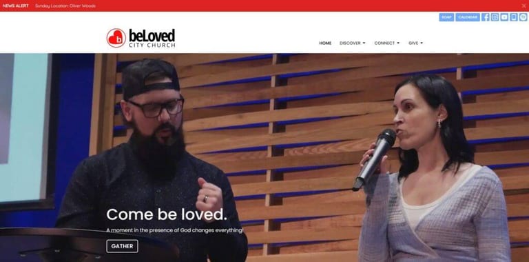
This is a great one. See that unique “Gather” button right there on the homepage? If a visitor clicks it, they’re taken to a welcome page that clearly lays out everything they need to know for a visit. Service times, address, dress code, and details on kids’ ministry.
That’s a feature I suggest all churches include on their websites. Visitors should be able to learn everything for a visit within 30 seconds of clicking on your site.
Beyond that, the website’s got a solid, stripped-down aesthetic that keeps everything clear and concise without getting too out of hand.
14. Austin Ridge Bible Church
Best for: All-around solid design with video testimonials
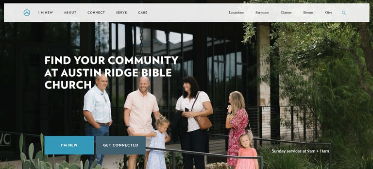
Austin Ridge is one of those classic, all-around solid church websites. It has great attractive photos, provides information clearly and cleanly, and has smooth navigation. The website also utilizes video really well. It has a scrolling list of past sermons to watch, along with a video testimonial to help provide some credibility to the church.
The website has a great aesthetic design. It’s got good colors, slick fonts, and a pleasing layout. Everything is really uniform, giving it a nice, cohesive image. Succeeding on all fronts, Austin Ridge is a great church website to inspire you.
15. ONE Church
Best for: Minimalist church website design
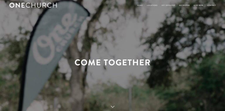
https://www.onechurch.net/#come-together
Beautiful, minimalist, and clear.
One Church’s website has consistent branding, a unique aesthetic, and tons of stripped-down clarity. Take a quick scroll down their home page, and you’ll see what I mean.
The only thing that could improve this website is a clear call-to-action button encouraging people to plan a visit. They’ve got locations and service times that are clear and obvious, but a little more information would be nice. Sometimes, just a clear call to action is all it takes for people to get interested in planning a visit.
16. Bedehuskirken Church
Best for: Nature-inspired minimalist design
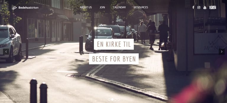
Here’s the first non-English church website on my list! This is a Norwegian church with a beautiful website. The fact that it’s written in another language just goes to show how well it’s presented. You can basically figure out what everything is even without understanding the words! That’s a sign of clarity in presentation.
Bedehurskirken has a beautiful aesthetic to it. They use the natural world in their area to advertise their church. You’ll see images of flowers, trees, and local wildlife. This is an awesome and enticing aesthetic choice for a church website, and isn’t really shared with anything else on this list.
17. Elan Church
Best for: Local SEO strategy built into design
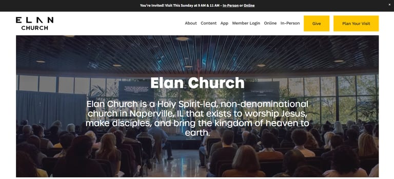
I love how the Elan Church website makes it easy to get all the information you need. The home page lays out vision, values, events, how to get involved, and past messages.
But here’s what really stands out about this website: Elan Church also knows something about local SEO. Local SEO has everything to do with getting your church discovered online. Throughout the site, note how often they refer to their location, Naperville, IL. You’ll also see intentional keywords incorporating “church in Naperville” and similar phrases. Part of designing a great church website is ensuring visitors find it when they search online!
18. Crossing Church
Best for: Minimalist homepage with smart use of negative space
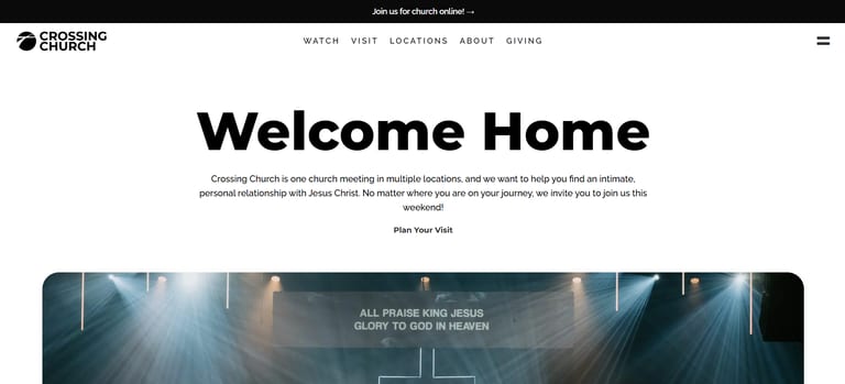
Can I just admire that logo for a second? A literal cross is shaped in a way to also make it look like a “crossing” of roads. It signifies both the sacrifice of Jesus on a cross and the “crossroads” everyone comes to when they choose to give their life to Christ.
This one is a great example of simplicity and minimalism. The homepage is very short compared to other websites on this list, and only includes the most important and eye-catching elements. Everything else is relegated to another page, which relevant CTA buttons lead to. It has a uniform aesthetic design and plays really well with its negative space to highlight important elements.
This is not at all exclusive to this church website, but photos showcasing your location and services is always a big win. People want to go to a church they’ve seen before, and not just arrive at a random location to figure things out. When site visitors see what worship will look like, what events look like, etc., it will make them want to be a part of those things.
19. Bethel Redding
Best for: Clean layout with organized ministry pages
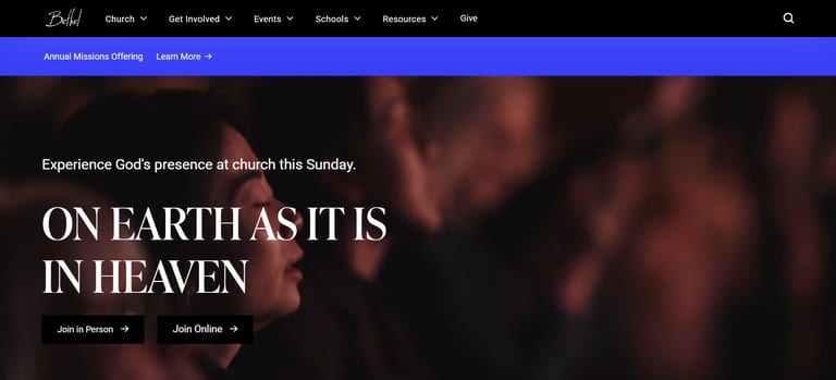
Bethel Redding has a more straightforward website, but it demonstrates a clean and tactful layout, so I wanted to add it to my Top 23 Church Websites list. Bethel Redding has done an excellent job with this design effort. Simple colors and clear text help keep the site consistent with its look and feel.
The ministries page is listed out so visitors can either filter or see everything the church has to offer, right in one spot. Bethel Redding has also done an excellent job on the children’s and youth pages.
20. Brentwood Baptist
Best for: Column layout with member portal
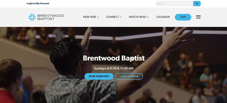
What initially stands out about this website is its “column” design. It keeps important info to the left (locations, dates, times, etc.) while showcasing cool events and photos on the right. It also leads with the videos of its most recent sermon series, which is really neat.
You may also notice a “member portal” at the top, where members can log in. It is clear for members who want to do this, but small and inoffensive enough that it doesn’t distract from a first-time visitor experience.
Everything else about the website is really clean and easy to navigate. Buttons are clear and lead you exactly where you want to go, it has a uniform aesthetic design, and so much more. Great work, Brentwood Baptist!
21. Liberty Live Church
Best for: Strong CTAs with clean section breaks
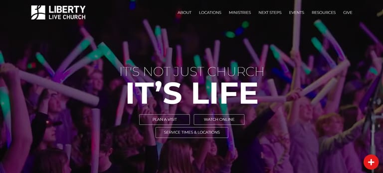
Liberty Live is another classic, all-around solid church website that you should definitely draw inspiration from. Their three CTA buttons, right when you open the website, are all strong and cover basically all the bases. The looping video they’ve got in the background is fantastic too; you’ve probably seen that on a few of the websites on this list.
When you scroll down, you’re presented with a really pleasing design. The layout is simple and clean, and looks good, and doesn’t overwhelm the eye. They split up their sections between white and dark backgrounds to make clear boundaries and use very little text to get their points across.
22. Bayhope Church
Best for: Family-friendly branding and color palette
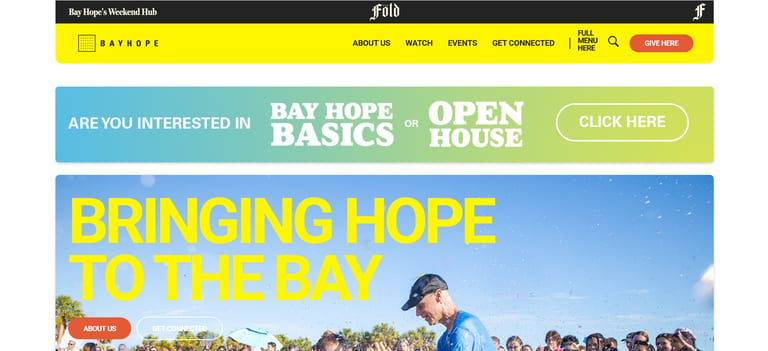
Bay Hope stands out as having really good branding and a cohesive aesthetic. It’s got two main colors: yellow and blue, and they use them excellently throughout the website. It has a fun, poppy, graphic-y sort of vibe as well, and that’s also used all over for great effect. It makes it appeal to families and kids, which helps it find its appropriate audience.
The website has a perfect level of text. Not too much, not too little. It feels full and alive, and presents answers to every question a newcomer may have. The personal search bar is also really helpful.
23. Be the Church
Best for: Ministry organization website clarity
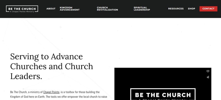
Okay, okay, maybe I’m cheating a little bit with this one. This isn’t a website for a specific church, but instead for a Christian organization that helps churches and ministries. If you’ve got an organization or page on your website similar to this, then let Be The Church inspire and lead you. Since it’s not a church, this website needs to explain the service it provides in a clear and succinct way.
Do you think the website does this? How long does it take you to scroll before you clearly understand what Be The Church does? Use the things that work, and change the things that don’t for your own website.
Ready to Build Your Own?
The best church websites share a few things in common: they put the visitor first, they keep the design clean, and they make it easy to take the next step.
If you’re feeling inspired and want to build something similar for your church, here’s where to start:
- DIY route: Check out the best church website builders to find a platform that fits your budget and skill level.
- Want help choosing? Read our guide on how much a church website costs so you know what to expect.
- Full-service option: My team at REACHRIGHT builds church websites designed to convert visitors into guests. We handle design, SEO, and ongoing support.
- Step-by-step guide: Our complete church website design guide walks you through every stage of the process.
A multisite church needs different features than a church plant. A small church with 50 members has different priorities than a megachurch. But every church needs a website that makes people feel welcome before they ever walk through the door.
Do you have a church website that you think I missed? Let me know in the comments below. I’ll check it out for the next update!