
In today’s digital age, a church’s website serves as a critical touchpoint for engaging with both current congregants and potential new members. With the majority of internet users now accessing websites via mobile devices, it is imperative for churches to ensure their online presence is optimized for smartphones and tablets.
A mobile-friendly website enhances user experience, making it easier for visitors to navigate, find information, and engage with church activities. It also helps in reaching a broader audience, particularly the younger generation who predominantly use mobile devices. Additionally, a responsive website can improve search engine rankings, increasing the church’s visibility online.
By prioritizing a mobile-friendly design, churches can better fulfill their mission of outreach, support, and community building in an increasingly mobile-centric world. Ready to learn more?
Let’s dive in.
Estimated reading time: 11 minutes
Table of contents
Mobile Friendly Church Websites

For many of us, the concept of church websites themselves still feel new. Technology and trends are moving so fast it can feel hard to keep up with it all. But if we want to stay relevant and reach new people, we need to make our websites like the best church websites out there. Whether you have church online or in-person, building your church community is more important now than ever.
Let’s explore more about mobile-friendly churches and why your church should make sure its website is mobile-friendly.
Church Websites Then vs. Now
When thinking about mobile friendly church websites, it may be best to start by looking at the past. It used to be that when a church needed a website they would have one developed and check it in a variety of different browsers. There a was a time when almost everyone used Internet Explorer (You are not still using IE are you?) but it was still important that you checked to make sure your church website worked well in Firefox, and Safari, and the fledgling Chrome browser. The reasoning was that we wanted the doors to our churches to be wide open to everyone, even those who browsed the internet with Opera.
In those days Internet Explorer had a whopping 85% of the market share, and yet we painstakingly ensured that websites looked perfect on all the other browsers in order to reach the most people for the kingdom.
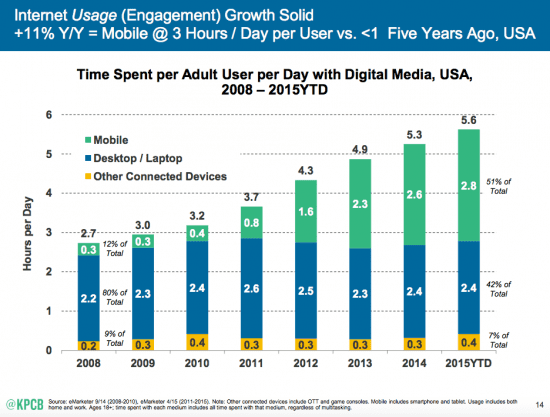
Fast Forward 8 years and it is a different world. Chrome is the browser of choice, Flash intros are all but extinct, and the majority of web surfing takes place on a mobile device. This last piece has been an enormous shift that has taken place in a very short time.
Mobile Design
It would be a bad decision to build a website that looks great in Firefox, but does not fuction well on Chrome today. So why are we giving mobile friendly church websites the cold shoulder like it is 2009? By not taking an approach focused on mobile devices, churches are giving over half of all their website visitors a terrible online experience. They are slamming their doors closed!
Mobile design should not be an afterthought but the first version of the site that we test if we are serious about reaching our communities.
The studies show that the younger the user the more likely they are to encounter your church website on a phone or tablet. Every church I talk to is clamoring to reach more young families and 20 somethings. Well, this is the place to start.
Defining a Mobile Friendly Website

So mobile-friendly websites are important. Great. But what exactly is the difference between a website that is mobile-friendly and one that isn’t? In this section, we’ll break down all the things that make a website mobile-friendly. If your website doesn’t have these features, we highly encourage you to start implementing them.
Mobile Friendly Church Websites Use Responsive Design
Responsive design is just like it sounds. A responsive website will will respond to the size screen it is being view on and will restack the content in a way that is optimized for that screen. When we build a website today we are really building four different layouts. One for desktops with large screens up to 4k, one for laptops with smaller screens, one for tablets, and one for phones with a tall and narrow display. A good web designer will think through this challenge before they start and will plan accordingly.
Retrofitting an old website to be responsive can be a time consuming and it not recommended. Make sure you next church website is a mobile friendly. Make it responsive.
Mobile Friendly Church Websites Allow People To Use Their Fingers
With a mouse you have the ability to hover over elements on the screen. That doesn’t work with fingers. Mobile friendly church websites will take this into account and will make sure that no mouse hovering is required.
The most likely culprit is your navigation. Several years ago we fell in love with drop downs in our navigation. They made it easy to organize lots of information on a church website. Drop downs can still be used, but when someone is on a mobile device your users need to be able to access your entire navigation without hovering.
Mobile Friendly Church Websites Do Not Use Flash
So many church websites still use flash as the primary language to deliver movement on the site. We still have people call us and refer to any moving part on the website as flash. Even worse, some churches build entire websites in flash. This must stop.
Flash is a language that is notoriously hardware demanding, and most phones do not support it without help from outside software. Movement is still important on a church website, but flash is not the way to accomplish this.
Mobile Friendly Church Websites Are Interactive On All Devices
When we originally started building church websites with mobile browsing in mind, the strategy was to build a separate website with a separate web address for people on mobile browsers. These were usually stripped down versions of the main websites, with just the bare essentials – A few ministry pages and some contact information. I remember clients saying things like – “Who would ever try to watch a sermon on a phone?”
Well as it turns out, lots of people would want to watch a sermon on a phone. Dare I say, most people would prefer watching on their phones or tablets while they do something else, as opposed to sitting in an office chair at their desks.
Today your site must do everything on your phone the same way it does it on your computer. People need to be able to see what’s happening, sign up for events, make a donation, and watch a sermon from their phones and not wish they were on their laptop instead.
5 Tips for Creating a Mobile Friendly Church Website

So we’ve made our point: having a mobile-friendly church is more important now than ever. But how exactly do you go about creating great mobile-friendly websites like the Summit Church website? How can you appeal to mobile users who may be interested in your church family?
These are our top 5 tips for creating that great church website that works for all users, no matter what device they are on.
Let’s find out.
1. Simple Navigation
Simple navigation is key for a mobile-friendly church website. Site visitors and church members should be able to find what they need quickly and easily. A clear menu at the top of the page helps guide users to important sections like service times, events, and contact information.
Avoid using too many menu options, which can overwhelm users. Instead, group similar items together under clear headings. Use simple language for menu labels to avoid confusion. For example, use “About Us” instead of “Our Mission and Vision.” Make sure links are easy to tap, especially for those using smaller screens.
Check out the website for Light Church in California. The website scrolls down very smoothly with very simple and clear words and directions. It is not hard to know where to go or what to get to what you want to get to on this website, even if you’re on a smaller device like a phone.
Keeping navigation straightforward helps site visitors and church members have a positive experience, making it more likely they will return to the site and stay connected with the church. Simple navigation is all about making it easy for everyone to find what they need without frustration.
2. Readable Fonts
Readable fonts are essential for a mobile-friendly website, especially for a real life church wanting to engage its members online. Fonts should be clear and easy to read on all devices, from smartphones to tablets. Choose simple, sans-serif fonts like Arial or Helvetica, which are easy to read on screens. Avoid overly decorative or script fonts that can be hard to decipher on small screens.
Font size matters too. Make sure the text is large enough to be read without zooming in. Typically, a font size of at least 16 pixels works well for mobile devices. Also, ensure there is enough contrast between the text color and the background. Black text on a white background is a safe and effective choice.
By using readable fonts, a real life church can ensure that its messages are accessible to all visitors, helping everyone stay informed and connected with ease.
3. Touch-Friendly Elements
Touch-friendly elements are crucial for a mobile-friendly church website. These elements ensure that users can easily interact with the site using their fingers, making the experience smoother and more enjoyable. Here are some key points to consider:
- Large Buttons: Make buttons big enough to tap easily, ideally at least 44×44 pixels.
- Spacing: Ensure there is enough space between clickable elements to avoid accidental taps.
- Simple Forms: Design forms with larger fields and buttons, making them easy to fill out on a mobile device.
- Gestures: Enable simple gestures like swiping for easy navigation and interaction.
- Clickable Links: Ensure links are easily tappable and not too close together to prevent misclicks.
- Feedback: Provide visual feedback when buttons or links are tapped, so users know their action was registered.
Check out the website for The Village church. They have all of the things in our list: big buttons, spacing between elements, links, and more!
By incorporating touch-friendly elements, a church can create a user-friendly mobile website, making it easier for visitors and members to engage with the church’s online resources and stay connected.
4. Test on Multiple Devices
Testing your church website on multiple devices is essential for ensuring a smooth user experience. Different devices, like smartphones, tablets, and various screen sizes, can display websites differently. By testing on multiple devices, you can identify and fix issues that might not appear on your primary device.
This helps make sure that all visitors have a positive experience. Additionally, search engines favor websites that perform well on various devices, improving your search engine ranking. By thoroughly testing your site, you help ensure that everyone, regardless of their device, can easily access and navigate your church’s online presence.
5. Feedback and Analytics
Feedback and analytics are vital for improving your church website. Collect feedback from visitors to learn what works well and what needs improvement. Use simple surveys or feedback forms for this purpose. Analytics tools, like Google Analytics, provide data on how people use your site, such as which pages are most visited and how long users stay.
This information helps you understand what content is engaging and where users might encounter issues. By regularly reviewing feedback and analytics, you can make informed changes to enhance the user experience, ensuring your church website remains effective and user-friendly.
Church Websites for Mobile

It is time to open our doors wide, just as we have in generations before. If we are serious about reaching people in our communities, we have to get serious about mobile friendly church websites.
Do you have any mobile pet peeves that we missed? What have you seen out there? Let us know in the comments section.
More Resources on Church Websites
About The Author