Building a website for a multisite church is harder than building one for a single location. You need campus-specific pages, location finders, shared branding across sites, and navigation that works for visitors at any campus. Get it wrong and you confuse people before they ever show up.
There are now over 5,000 multisite churches in North America, and that number keeps growing. Whether you’re launching a second campus or managing a dozen locations, your website needs to hold it all together.
We’ve rounded up 11 multisite church websites that handle multiple campuses well. Each one offers practical ideas you can borrow for your own church website.
Looking for more church website inspiration? Check out our 23 Best Church Websites of 2026.
What Makes a Good Multisite Church Website?
Designing a website for multiple campuses comes with challenges that single-location churches don’t face. Every location needs to feel connected to the same brand while still having its own identity. Visitors need to find their specific campus quickly without getting lost in a maze of pages.
The best multisite church websites solve three problems at once: they help new visitors find the right campus, they keep members connected across locations, and they make it easy for staff to manage content without needing a developer for every update.
Here’s what to focus on.
Structure and Navigation
Each campus needs its own page with service times, address, and campus-specific events. Visitors should be able to find a campus near them within seconds through a clear “Locations” section. For churches with five or more campuses, an interactive map is almost essential.
The best church websites also give each campus page a space for introducing key leaders, like the campus pastor, and a way to connect directly. This builds a sense of belonging and gives each location its own personality within the larger church network.
SEO for Multiple Campuses
Local SEO is critical for multisite churches because each campus competes for visibility in its own area. Each location page should be optimized with location-specific keywords like “church in [city name]” or “[neighborhood] church.” This means unique title tags, meta descriptions, and content for every campus page.
Each campus also needs its own Google Business Profile listing. Without it, you’re invisible in “churches near me” searches for that area. Blog content and event updates tied to specific campuses also help each location rank well on Google.
Choosing the Right Platform
Not every church website builder handles multiple campuses well. Some platforms make it easy to create campus-specific pages under one roof. Others require you to build essentially separate websites for each location.
When evaluating a platform for your multisite church, look for:
- Campus-specific pages that live under one domain (not separate websites)
- Shared navigation and branding across all locations
- Location-based content that can be different per campus (events, staff, service times)
- Scalability so adding a new campus doesn’t require a full redesign
- Centralized management so your team can update content without a developer
Features like a centralized calendar or events page can help visitors stay connected across campuses. If you’re in the early stages, our church website cost guide breaks down pricing for different approaches.

Top 11 Multisite Church Websites
Now let’s look at 11 multisite church websites that handle multiple campuses well. Each one offers something worth borrowing for your own church website design.
1. Elevation Church
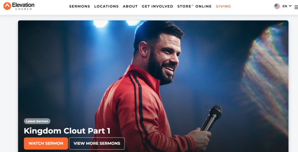
We start with maybe an obvious choice, Elevation Church. Sometimes when things are really popular it’s because they are just really good. Simple as that. They have over 20 different locations.
They have a great map and picture icons for each church. This gives you a little sneak peek at what you can expect to see before you visit. Anything you can do to give a visitor information that will help them come and assimilate it is very important to do it!
Elevation Church has done well to show who they are through its site and did a wonderful job with its multisite web page. The multisite location map provides a way for a visitor to easily see which location would fit them.
The different sites are also in an eye-catching tiling. The square tiles with rounded edges look clean and give just enough of a look at each geographic location. A clean white background helps the photography to stand out as well as their pop color of orange.
2. Life.church
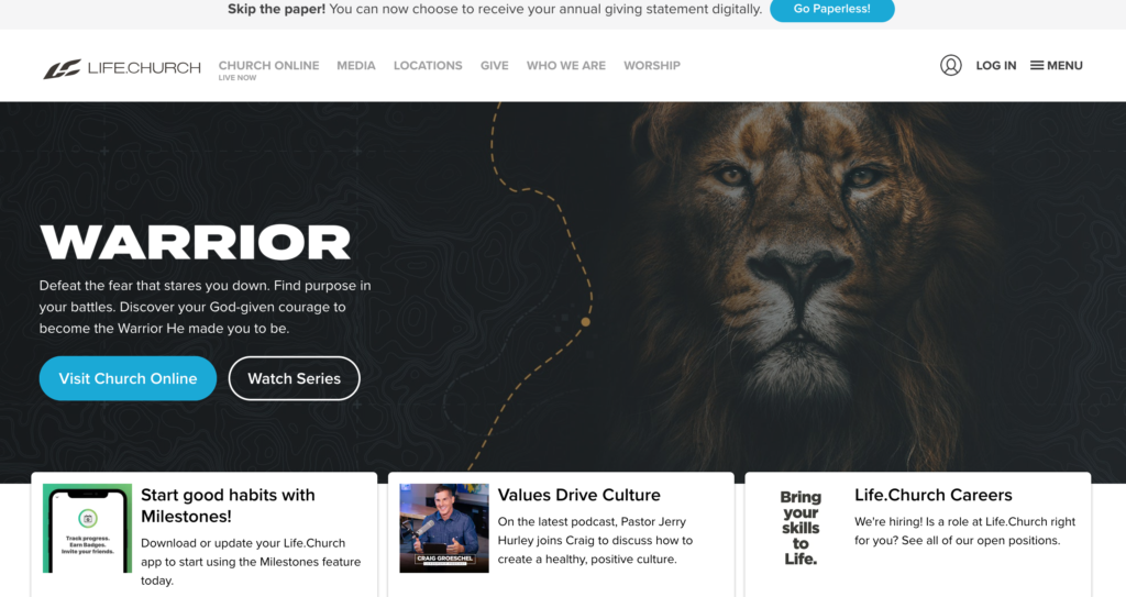
Life.church is a great example of a church that is using a website to the fullest. This one main site is connecting churches in 12 different states! All in all, this is a robust site that offers good connections between their multiple locations acting as one large group collectively.
We love the larger look at the body of Christ and how we can all work together. Life.church makes a very large amount of free resources available to other churches and ministries. When an unchurched visitor is on the site, they are sure to be refreshed by such a spirit of love, care, and generosity between churches. Great work, Life.church!
3. Eagle Brook Church
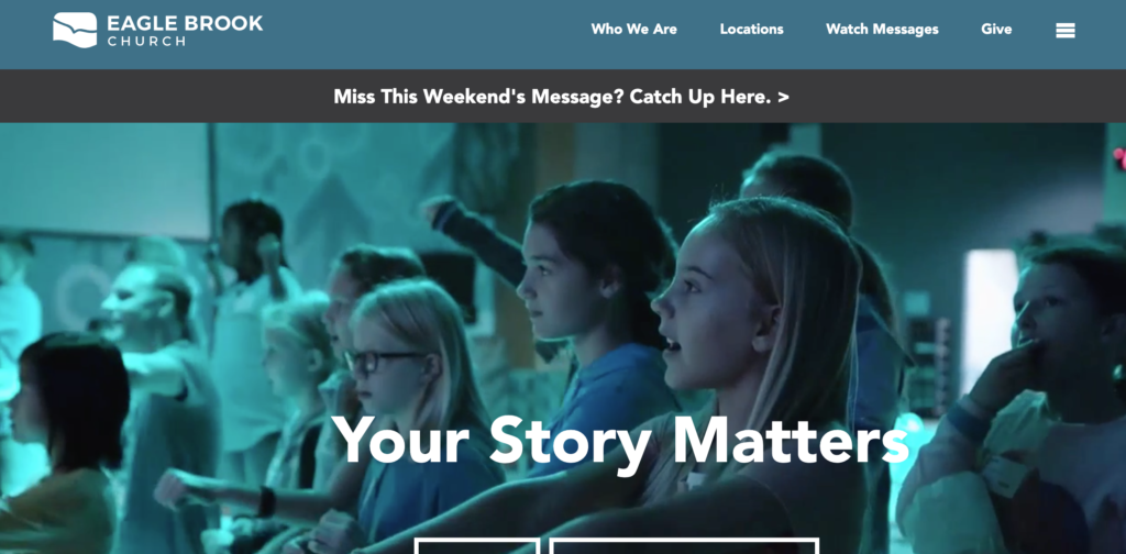
Eagle Brook Church has very engaging videos that catch your attention quickly. Their videos include adults and children, making them appealing to a wide audience. We also really appreciate a well-done opening video, which often captures interest better than a still photo.
They have 13 locations. The locations/churches are easily available. The menu links are completely focused on the visitor. This is a great idea because members of your church WILL use your website but you want to appeal to the person who is not yet a member of your church or user of your website.
If you want more information you can use the drop-down menu to find the right one. You can also link from the main site to the smaller locations. There is also a button on the main page to link you to service times and locations. We also appreciate how Eagle Brook kept their site very simple. Just the right amount of information but not so much you are overwhelmed. Great job!
4. Dream City Church
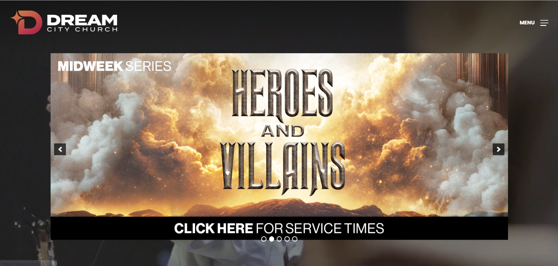
Dream City Church is anchored to a landscape, namely the Arizonan desert. The beautiful aerial video is a great way to show pride in a place and also give a visitor a glimpse of the building they will be looking for when they first visit. We also think that they have a pretty cool logo.
They have a dual menu bar that is interesting if you have 2 distinct menus. It’s not a good idea if what you need to do is edit down your separate pages. Dream City Church has 11 different locations. On their locations page, you can also find what the different service times are. This eliminates the need to go off the page if you are looking for simple information.
One last thing that we thought was smart was social media invite links. 4 different invite links are a modern way to invite a friend. Though it is not as personal as a verbal invite, it is how people invite friends to things in this modern age, and it’s always smart to adapt.
5. Saddleback Church
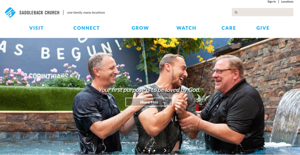
Good photography that communicates real emotions and human relationships is a vital tool in the multisite church website. Saddleback Church does a fabulous job of this. People are emotional creatures and if you can honestly appeal to your visitor with a warm emotion, you will be doing well.
Organization and intentionality are well and good but if they fail to appeal to the emotions and the heart you are missing a big opportunity. You would be hard-pressed to find a more joyful picture than an awesome baptism photo capturing this big moment in a member’s life.
Saddleback Church’s tagline is “one church, many locations”.
“We are one church in many locations. Whether you’re from Orange County, Hong Kong, or somewhere in between, we have a campus for you.” This is clear information that says, “We prepared for you. You are wanted here.” They have churches across the nation and even across the world.
6. Woodside Bible Church
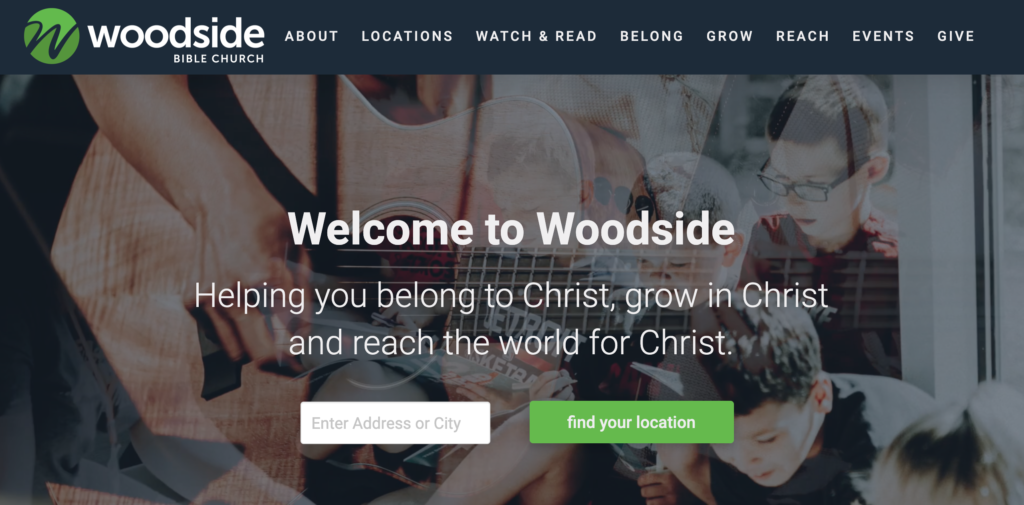
Woodside Bible Church shows the value they place on their many locations all being one church by putting a button right on the landing page. The accent color draws the eye and prompts action. The scrolling photography communicates that everyone can be included and that all types of people are represented.
The 14 locations are all represented by a photographic link. It is striking how different all the locations and buildings are. You would never guess they are all in the same group of churches. If you hover over a location link you are also provided with an opportunity to “Read More” about a location before actually leaving for that page. This is a smart choice for multisite church websites.
7. Doxa Deo
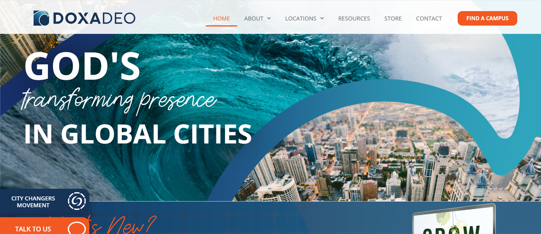
We really enjoyed this look at an international group of churches called Doxa Deo. They have churches in the UK, New Zealand, Europe, and Africa. The first obvious choice on the main website is to choose a location. There are a few different panels on the site that encourage interaction. These are just simple questions but they engage your visitor and hopefully helps them a step closer to actually visiting your church IRL.
Another thing we noticed is that there are pages that a similar in message but the colors had been altered depending on the location. This further points to the message, “We are alike and yet have our own personality”. Simple and smart solutions on how to connect multisite church websites to each other. Great job, Doxa Deo!
8. North Point Church
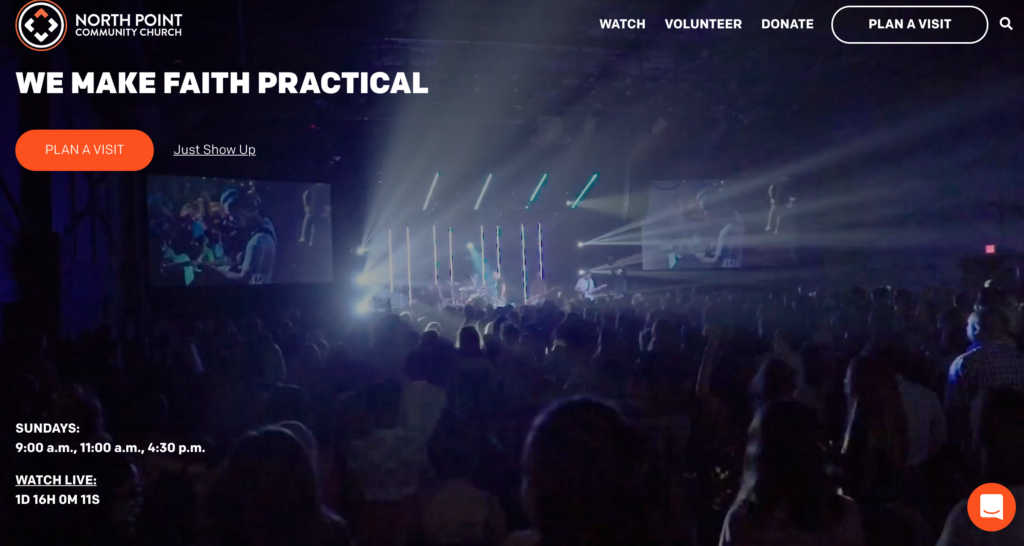
North Point Church has 6 churches in the Atlanta metro area. To start, there are a number of short videos introducing different age groups. These are effective and communicate that there is a place for you at North Point.
It is so important that you are aware of the message you send your visitor through your website. You want to try hard to identify your values so you know how to communicate what’s important to your organization.
Something that we have seen on almost all of the multisite church websites we are featuring is the ticker clock for their next live service. This is a great way to build a feeling of excitement around joining live with a service. Another feature we often found alongside the ticker clock was service times being available. You never know how long someone will be able to spend on your website. You want to capitalize on the time and give important information easily.
9. Cross Church
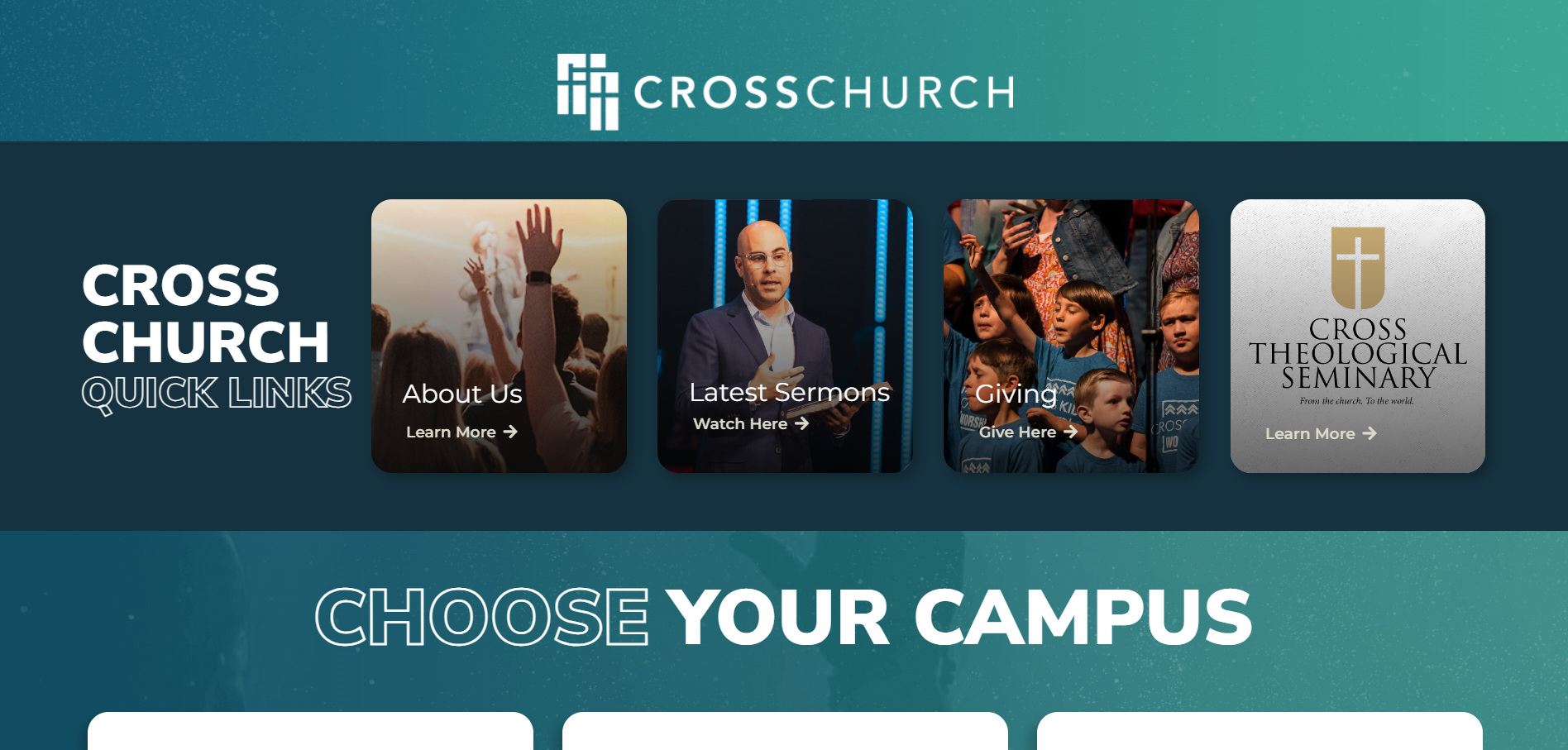
We love what Cross Church does with their simple and clear navigation and their campus finder. When you are looking at the churches in the campus finder, it gives you the simple options to “Visit Campus Site” or “Plan a Visit”.
It is worth mentioning that there is good intentionality in the design. While their website used to look more corporate, it now has a nice accent color to allow for some more visual interest. The color palate has some life to it, which works alongside the photos.
Churches of this size often ride the line between a bit of a corporation and a group of people with common core beliefs and worship practices. Anything that causes your church to pop off the screen is a good thing.
10. Church of the Highlands

With 26 different locations, Church of the Highlands is a massive multisite church. Because of this, simplicity in the organization of the site is really important. We also love the color scheme they’ve chosen. The very pale blue is reminiscent of the color of the sky which works really well with the darker accent blue color.
3 large tiles dominate this multisite church website. These 3 tiles answer 3 main questions a visitor might have: “What does the teaching sound like?”, “How do I plan a visit”, and finally, “How should I get involved with their Bible reading plan”. Yeah, that last one might not be the most important thing to put front and center in your website. Something like “I’m new, where do I start?” could be more effective for visitors.
There is also a ton of cool features and visual pops as you scroll down the website, highlighting all sorts of ministries and initiatives. All in all, we’re really impressed by Church of the Highlands.
11. Bethel Church
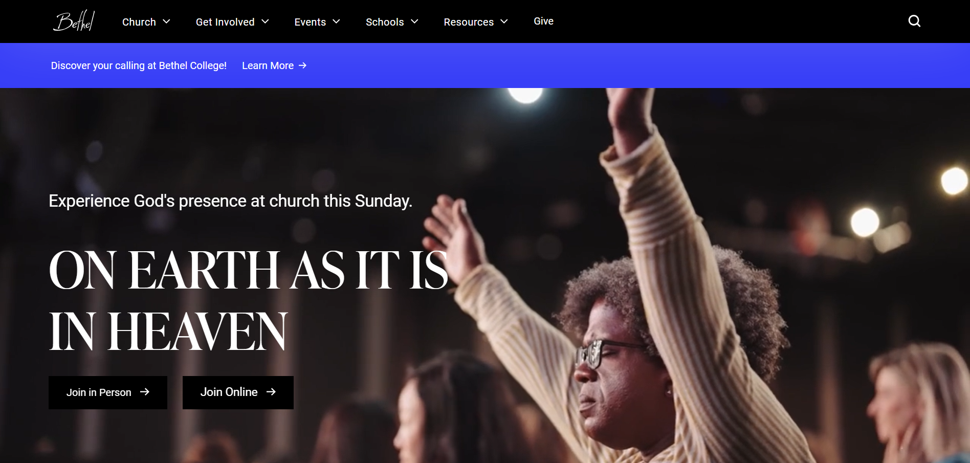
Bethel Church has a very striking home page. The text is black on white or white on black and everything is clear and easy to follow. There isn’t a hundred buttons or things grasping for your attention.
Bethel still functions as a multisite church, but their website communicates that there is one main church with some smaller affiliation churches. If that’s the way your multisite church works as well, you can pull some inspiration here!
Over the whole website, there is a lot of great emphasis on a new visitor. There are obvious buttons for you to “Join In-Person” or “Join Online”. For your own site, we’d encourage you to make the experience of the visitor as prioritized as possible.
Frequently Asked Questions
Build Your Multisite Church Website
The common thread across all 11 of these websites: they make it easy for visitors to find their specific campus and take the next step. That’s the bar your multisite website needs to clear.
If you’re building or redesigning a multisite church website, here’s where to go next:
- Compare platforms: Our best church website builders guide covers which platforms handle multiple campuses best.
- Understand costs: The church website cost guide breaks down pricing by approach.
- Get professional help: REACHRIGHT specializes in multisite church websites. We build sites that scale with your church as you add campuses.
- See more examples: Check out the 23 best church websites of 2026 for more inspiration across all church sizes.