At this point, we all know that every church needs a website. It’s the first impression of nearly everyone who visits your church. Unfortunately, you can easily fall into some of these common church website mistakes.
Studies show that you have less than three seconds to make a first impression online. Church websites are a hub for church information. Whether you’re a first time visitor or a long-time member, you want to access web pages where it’s to find contact info, online giving, and a typical service.
So let’s take a look at seven common church website mistakes to avoid.

7 Church Website Mistakes to Avoid
We’ve had the privilege of working with lots of churches over the years. It’s amazing how a few church web mistakes can dampen the first impression of your church.
On the other hand, these issues are all easy to fix. Just take some time to ensure your church marketing plan isn’t suffering as a result of any of the following website mistakes. And if you want a comprehensive resource for getting your site right from the start, check out our church website design guide.
Mistake #1 - Pastor Focused Homepage
At first glance, a pastor may seem like the perfect image to grace your homepage and represent your church.
But a big picture of the pastor shouldn’t be the main feature of your homepage. It doesn’t necessarily inspire people to visit because the question they’re asking is: What about me?
Don’t get me wrong; potential new visitors will want to know about your pastor. In fact, a key factor for new people is whether they feel a connection with the pastor and like their preaching style.
So put enough information about your pastor on your website to meet this need, but a lengthy bio is better suited for an About page than a home page.
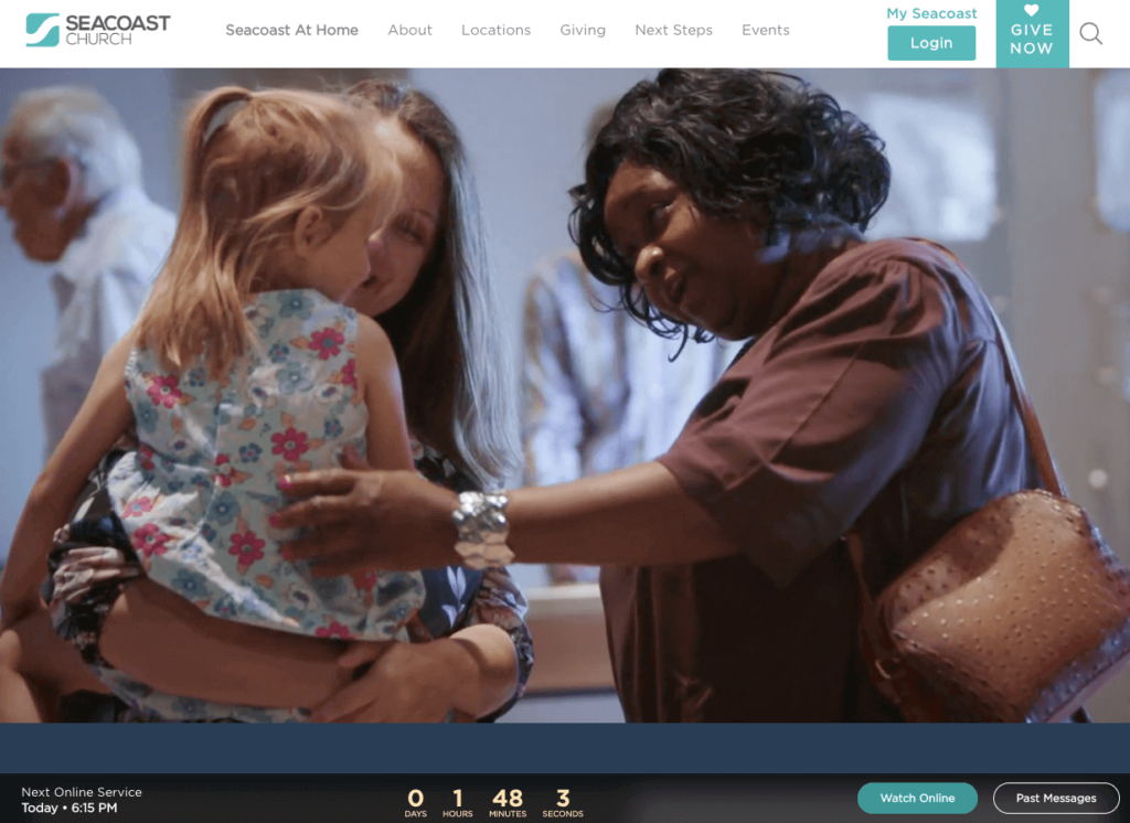 A great church website example of a home page focused on the people.
Mistake #2 - Building Focused Homepage
Like the first mistake, your physical building is important, but it should not be the primary focus of your church website’s home page.
The church building is a tool to help facilitate ministry and reach out to potential visitors, but it doesn’t give people an enticing view of the church’s life.
Remember, most people (especially younger generations) are looking for answers to questions like: Who will I meet? Will I fit in?
To answer these questions, focus on candid shots of people in and around the church. Your photography team is vital for this step–choose people!
Mistake #3 - A Church Website That’s Not Mobile-Friendly
This is one of the biggest mistakes you can make: not having a mobile-friendly church website. It’s only getting more important with each passing day, as the majority of all web traffic now comes from tablets and mobile phones.
You’re cutting off a large segment of your church’s potential visitors if you’re not making your church website responsive to the various devices people are using to access it.
You need to ensure that your church website is mobile-friendly. Think about scrolling vertically, not horizontally. Bigger fonts and buttons are also a great idea.
Failing to create a mobile friendly website is one of those common church website mistakes you cannot afford to make. If your site needs a refresh, a professional church web design service can ensure it looks great on every device.

Mistake #4 - Not Adding Text to Your Sermons Page
Having a page for your church audio and video sermons can be a great addition to your church website. Just make sure you also include text.
Many people watch church online or want to go back and revisit the past weekend’s sermon. Or they might want to search for a sermon topic for a particular issue they’re going through or something they’d like to learn. For example:
- finding hope in difficult times
- how to parent in today’s world
- developing your prayer life
- a specific book of the Bible
Adding text–including sermon notes, outlines, and summaries–makes it easier for people to find what they’re looking for and (hopefully) return again and again to the page.
But it’s more than just a convenience factor…it’s essential for your website’s search engine optimization (SEO). SEO is how people find your church website in Google and other search engines.
Search engines can’t analyze the content of a video; they need text to explain what the page and video are all about. So when you upload a sermon, make sure you always have
- a descriptive title
- a lengthy description
- upload a sermon manuscript (if you have one)
Mistake #5 - Hidden Service Times
People can’t visit your services or events if they don’t know when and where to show up. So the times of your worship services need to be prominent, along with your name, address, and phone number.
You’d think it would go without saying that your church service and event times should be highly visible on your church website, but this is one of the mistakes on church websites we’ve seen time and again.
Knowing when and where your church services are is critical information for new people considering attending church for the first time, so don’t make them search high and low for this information.
Here are some things that should be prominent on your website:
- Church name
- Service times
- Church address
- Contact info like church phone number and email
- Social media links
- Online giving
Make it hard for a new visitor to miss service!
Mistake #6 - No Calls to Action
Every time you preach a sermon, you have a clear next step for people to take. The same principle applies to the information you’re presenting to new people online.
In marketing terms, that action step is a “call to action.” It’s what you want people to do next.
So as you work through your website, the key question you have to ask yourself is: What do I want someone to do after reading this page?
If there’s nothing for them to do, then you might want to consider taking that website page down. Every page should have a clear purpose. Your website isn’t meant to be a lengthy brochure stuffed with random information.
Mistake #7 - Out-Of-Date Information
Is your Easter graphic still featured on your homepage in July? Or is latest sermon one that you wrapped up four months ago? Is your latest blog post titled “Hello World?”
If so…you have an out-of-date website.
To visitors, this says something about your church. It says you’re not paying attention to detail, and that you’re not staying fresh on what’s currently happening.
Plus, it’s frustrating! How can people find what they’re looking for or invite their friends if your website is inaccurate?
Make sure you keep your church website up-to-date with fresh content, images, and graphics. You want your church to look alive and vibrant–not stagnant or outdated.
Are You Making Any Church Website Mistakes?
Want to make sure your site is attracting new visitors and not scaring them away? Check out our 100% free church website strategy review. It is full of practical advice to help you see more visitors each Sunday.
Last year my church put some of these changes into place and we saw an additional 367 visitors walk through our doors. With a few tweaks, you can see a huge increase in visitors too!
What Have You Seen?
These are just some of the many church website mistakes I have encountered over the years. I have seen each one of these more times than I care to remember.
Have you made/seen any of these mistakes? Have you seen any that I missed? Let us know in the comments below.