The most successful church Facebook ads stand out to users and help you grow your church. But, what do they do differently?
If your Facebook ad campaign isn’t performing as well as you want, it may be time to change your strategy. In fact, that’s how successful Facebook ads campaigns work. The brands behind them adjust their strategies until it’s perfect for their audience.
So, don’t give up on Facebook ads just yet. Instead, just master these 16 elements to start seeing better results.
1. Focus On Solving A Problem
Raise your hand if most of your ads say something like “Come join us on Sunday for worship services” with the church name or “Come to our holiday concert.” There’s nothing necessarily wrong with this type of Facebook ad, but they’re easily ignored.
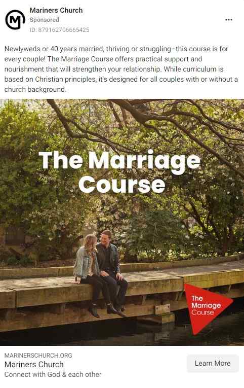
The best church Facebook ads take a different approach. They focus on solving a problem. It’s not about just asking people to do something. The two examples above sound like your church needs people. Instead, focus on why people need your church.
Let’s rephrase the two examples above to focus more on solving a problem:
“Come join us on Sunday for worship services” could become “Feeling lost in your faith? Free guidance every Sunday.”
“Come to our holiday concert” could say “Boost your holiday spirits and find the meaning of the season. Find out more about upcoming events here!”
Notice how both change from asking someone to come to your church to giving them a reason to attend. Putting the user’s needs first in your church marketing strategy and Facebook ad grabs their attention. It also shows that your church really understands what users are looking for.
Church Facebook Ads Examples - Solving A Problem
2. Keep The Message Clear
Facebook ads aren’t blog posts. Users are looking for a clear message. You don’t have the time or space to go into detail.
However, we’ve probably all seen those ads that are either too sparse or too much of everything. What they have in common is no one really has any idea what the message is. Taktical has some great examples of Facebook ads that really miss the mark on their messaging.
Exhibit E on Taktical is the perfect example of a message that’s not clear at all. It reads more like a short blog post and has so much clutter that users are more likely to skip it than even glance to see the brand.
Don’t be like Exhibit E. Keep your message clear. A little text goes a long way when it comes to an ad. Think clearly about your goal and come up with a few sentences that fit that goal and solve a user’s problem. Do that and you’ll have a clear message that’ll instantly attract the right audience for your church website.
3. Know Who Your Facebook Ad Campaign Is Targeting
As you already know, Facebook ads aren’t free. That’s why you need to make the most out of your church Facebook ads. The last thing you want to do is invest in ads only to see no results.
One of the keys to effective church advertising campaigns is nailing the targeting. In your facebook ads manager account you can do a deep dive into the exact kind of person who should see your ads.
Facebook advertising stays profitable because it gathers data from every user profile. All of that helps brands reach the right audience with their ads. For instance, if you’re trying to invite people in your local community to a holiday event, you wouldn’t need to target people 500 miles away.
Facebook provides indepth audience insights to ensure your ads are reaching the most relevant audience. At first, it can seem overwhelming going through all the various options, but once you do, it’s much easier for subsequent campaigns.
You have three types of audience selection tools to use in your Facebook business account manager:
- Core audiences – Focuses on custom demographics, such as location, age and interests
- Custom audiences – Focuses on people who’ve engaged with your church on social media, your website and even offline (you can upload contacts)
- Lookalike audiences – Focuses on creating an audience similar to the one you currently have, such as looking for more people with demographics like your church’s Facebook page followers
Use these tools to target your audience so the only people seeing your ads are the ones most likely to click. While this won’t guarantee that everyone will click, it does maximize your chances and visibility.
4. Use The Right Image
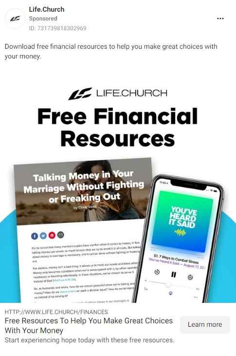
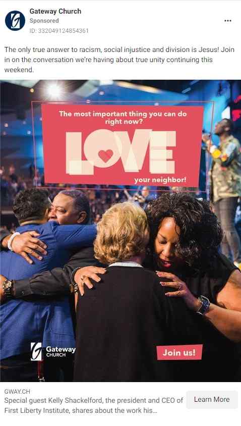
The right image makes all the difference on Facebook. The most successful church Facebook ads have a captivating image. Facebook posts in general perform better with images, so it’s a good idea to use the same kind of images for your church ads too.
While you can use stock images, typically original images work better for your church advertising strategy. People have usually seen the same stock images so many times that they just scroll right past them.
Try to take original photos that match your ad. Even just a colorful background with a cartoon-style image works well. Just make sure it’s relevant to your ad. After all, if someone sees a picture of a cute animal, but your ad is asking for people to watch your online sermons, they might not trust your future ads.
Of course, you could take the approach of a cute animal image and say “Now that we have your attention, have you let God help ease your stress as well?”. It’s not always effective, but it can work.
There’s also something else to consider. Try to limit the text that’s in your image. Until September 2020, Facebook actually restricted how often ads ran that included images with over 20% text on them. That’s now changed, but Facebook still recommends keeping any text within your image below 20%. This doesn’t include the text within the ad itself, just the image.
5. Consider Using A Short Video
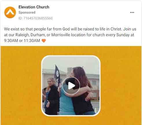
You’re not restricted to just images, though. When you want to say more than your ad has space for, use a video instead. It could be your church’s pastor delivering a short message, a testimonial from a member, footage from a recent volunteer event, or even just a tour of your church. Some churches even create short slide shows.
Images help you get your message across better. For any users with auto-play enabled, your ad instantly stands out. However, many people use Facebook on mobile and may not have this feature enabled. But, videos are still highly effective for grabbing attention and better explaining your message.
One thing to keep in mind is 85% of Facebook videos are watched without sound. So, make sure your videos make sense even with sound or use captions.
6. Keep Your Message Concise
Just as important as keeping your ad’s message clear, the most successful church Facebook ads keep messages concise. The more text you throw at a user, the more likely they are to just keep scrolling. Above your image, you have room for a concise message that grabs users’ attention.
There are three elements to focus on – the attention-grabbing statement, the quick description and a call to action.
First, the attention-grabbing statement is similar to a headline (which goes under your image with a short description). Make a statement that immediately explains the value your church has to offer existing members and new visitors. This goes back to the beginning of this post – focus on solving a user’s problem.
The next sentence gives a little more detail. Remember, keep this short. The shorter the message, the better, but a little extra description helps. You only have 125 characters for the text portion of your ad.
As a side note, if you want to check the latest Facebook ad sizes, Sprout Social’s guide is invaluable.
Finally, you can add a short call to action, such as a shortened URL with “learn more.” Or, you can skip the CTA here and add it below the image where you have CTA button anyway.

7. Use A Call To Action In Your Church Advertising Strategy
No matter where you put it, always include a call to action on your Facebook ad. Otherwise, users see an ad, but have no idea what to do with it. Your CTA tells people where your link is going.
For example, you might have an ad that says “Busy schedule that doesn’t fit traditional worship times? Online worship helps you worship anytime and anywhere.” That’s good for your initial text, but users need a push to click your ad.
Your CTA then tells users why they’re clicking. Below your image, you have the option of adding a CTA button. For the copy above, you might have a “Learn More” button. Then, users know when they click, they’ll learn more about online worship. It seems simple, but it’s surprisingly cost effective.
8. Use Your Headline And Description Effectively
You have a short headline and description section under your ad’s image and headline. This is a great place for a short tagline or CTA. For example, Digital Marketer helps you see how major brands are using the headline and description area to add things like discount details, brand tagline, download prompts, and more.
This is often called your link description as it helps further describe the link in your ad. Make it short and catchy to further encourage users to take action.
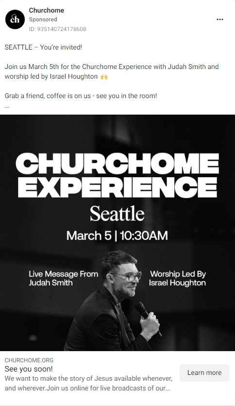
Headlines are usually less than 10 words (up to 25 characters, though), while descriptions are up to 30 characters. Adding your church’s location to the headline is a great way to stand out to those in your community.
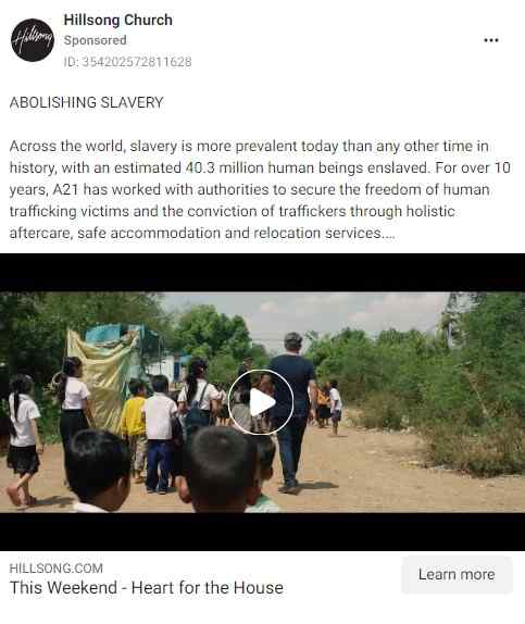
Some brands only use the headline part, but you can definitely use both. Try to add words that encourage immediate action, such as “now,” “limited availability,” “today” and “free.” Look at this Facebook event ad:
9. Test Out Different Facebook Ad Copy
One thing all the most successful church Facebook ads have in common is they test out different ad copy strategies to see what works best. For example, they might try different CTAs or various text copy. They might test how different types of images perform or how images perform against videos.
This can all be accessed from your Facebook business manager account. Typically, churches create two campaigns with the same end goal, but the ads are formatted and phrased differently. This helps them see what their audience responds to best.
So, if you’re not getting the results you want, try tweaking different elements. It may take a few months to figure out the best approach, but when you do, you’ll have the perfect formula for your own church, and audience.
10. Pay Close Attention To Your Facebook Page Analytics
Facebook wants your ads to succeed. After all, the more successful your church Facebook ads are, the more likely you are to buy more ad space in the future.
This is why you get detailed analytics to help you monitor how well your ads are performing. While there are numerous metrics to look at, there are five that really give you the most important information, including:
- Conversion rate – This is the action taken after someone clicks your ad.
- Frequency – If your Facebook ad is shown too often, it can have a negative effect. Switching out your ads regularly helps reduce this problem.
- Return on ad spend – This compares what you’re spending to what you’re getting in return.
- Cost per click and click-through rate – Both focus on how much people like your Facebook ad and engage with it.
- Cost per action – Compare this to the other metrics to better see how effective your Facebook ad campaign is in comparison to what you’re spending.
11. Create A Great Landing Page
One of the most overlooked elements of successful church Facebook ads is a great landing page. This doesn’t always mean a traditional church advertising landing page. It could be any page on your church website, including blog posts.
What matters most is that the church Facebook page you’re linking to provides more information to the user who clicked your ad. It needs to be highly relevant and keep engaging the user. Otherwise, they won’t continue engaging with your church online.
Let’s go back to the online worship example for a moment. If your ad just links to your church’s homepage, users are going to be confused. However, if you link to a page that provides links to online sermons, live streaming details and more information on your church’s online presence, users may stay on your site longer and even try out your online worship options.
12. Optimize for Mobile
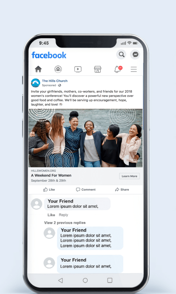
In the fast-paced digital era, mobile optimization has become vital for impactful advertising. As users increasingly navigate online platforms through smartphones, it’s imperative to tailor ads for seamless mobile experiences.
Stand-out visuals and clear and concise messaging are essential for capturing attention during rapid mobile scrolls. As we’ve covered earlier on the list, video content can be very powerful. It has proven doubly effective on mobile, as an ad that moves and talks is more likely to grab someone’s attention while they are quickly scrolling.
You’ll also want to make sure there are little to no load times associated with your ad. A sluggish ad risks losing the interest of an impatient audience. Make sure to streamline images and minimize excess elements. These are crucial for swift loading and user satisfaction. The advertising landscape has become dominated by mobile. Mastering optimization is not just a strategy; it’s a necessity for advertisers navigating the ever-evolving digital terrain.
13. Create a Sense of Urgency
Creating a sense of urgency in your marketing can be the secret sauce that transforms potential customers into active ones. The world of online consumption is fast-paced and cutthroat. Attention spans are fleeting, so creating a feeling of immediacy can be a powerful motivator.
You’ll want to craft compelling copy that communicates limited-time offers, exclusive deals, or time-sensitive promotions. Phrases like “Act Now,” “Limited Stock Available,” or “Offer Ends Soon” can evoke a sense of scarcity, prompting users to take immediate action.
Urgency not only drives conversions but also taps into the psychology of FOMO (Fear of Missing Out), making your offer more enticing. However, authenticity is key; ensure that the urgency is genuine to build trust with your audience. By utilizing the psychological impact of urgency, you can push your audience from contemplation to decisive action.
14. Use Carousel Ads
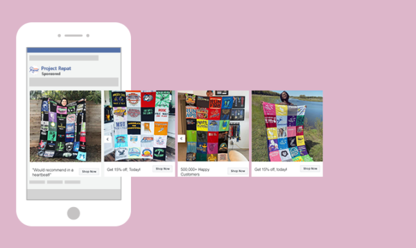
Another great tip is to utilize the full potential of Facebook advertising with carousel ads. These are the ads made up of multiple images in a slideshow that users can swipe through. You can think of them as a storytelling device, where each swipe reveals a new chapter.
Whether you’re showcasing diverse product features or narrating a captivating brand saga, carousel ads give you more freedom in your advertising. Users can seamlessly swipe through a curated collection, engaging with your advertising on a deeper level.
Don’t be fooled though, carousel ads don’t let you stuff as much as you possibly can into your church’s facebook ad campaign. You still want to keep them refined and simplistic, displaying only the most important and attention-grabbing information. The first slide especially should be something that Facebook users want to keep swiping on.
15. Incorporate Social Proof
A great way to elevate your church’s credibility is by utilizing “social proof”. This is when you display things like comments, reviews, testimonials, and other things from third parties to help affirm your credibility. Here are some of the different forms of social proof:
- Customer Reviews - In the case of church advertising, this could be like a glowing Yelp review of your church or something similar.
- Testimonials - Real testimonies or quotes from people who have been impacted by your church can go a long way in convincing others to give your church a try.
- Case Studies - You could dedicate a whole ad to a success story, showcasing how your church’s ministry transformed a life (or a family).
- User Ratings - A quick glance at star ratings provides an instant snapshot of the overall awesomeness of your church.
- Influencer Endorsements - When a high-profile figure in the Christian community (think famous pastor or speaker) speaks highly of your church, their endorsement brings authenticity and widens your reach.
- Social Media Mentions - User-generated content and shoutouts on social platforms can create a buzz around your brand.
By incorporating these varied forms of social proof, you can prove that you’re not just another church. You have real impact and have changed real lives. Let the voices of your satisfied customers be the megaphone for your church’s success!
16. Keep Branding Consistent
Finally, the extra subtle sauce you can keep in mind is to keep your branding consistent among all your Facebook campaigns. Think of your branding as the glue that holds together every interaction, from your website to social media and beyond. When your branding elements align, it can be that extra thing that gets you clicks.
Consistency builds trust. When your audience encounters a familiar logo, color scheme, or tone across different platforms, it creates a sense of reliability and authenticity. It’s the small secret that fuels recognition, making your brand stand out in the crowded marketplace.
So, even beyond your Facebook ads, to your website design and packaging and more—keeping your branding consistent is key.
Frequently Asked Questions (FAQ)

Do Facebook ads work for churches?
Yes, Facebook ads can work for churches. They help reach people in the community by targeting specific groups, like families or local residents. Ads can promote events, sermons, or special programs. They’re affordable and let you track results. Success depends on clear messages and inviting content, like videos or images, to connect with viewers and inspire them to visit.
How do I advertise my church on Facebook?
To advertise your church on Facebook, create a page for your church. Use engaging posts, photos, and videos to share events and messages. Boost posts or run ads targeting your local community. Highlight special programs or services. Keep the tone warm and inviting to encourage people to connect and visit.
Can churches live stream on Facebook?
Yes, churches can live stream on Facebook. Simply set up a Facebook page and use the “Live” feature to broadcast services, events, or messages. It’s a great way to reach a larger audience, especially those unable to attend in person. Ensure good video and audio quality for a smooth experience.
Can you target Christians on Facebook ads?
Facebook ads allow you to target interests related to religion, including Christian-related content. You can reach users who have engaged with Christian pages, groups, or topics. However, it’s important to ensure your targeting is respectful and aligns with Facebook’s advertising policies.
Church Facebook Ads

Digital outreach for churches is hard. We’re church leaders; we get it. But we hope that with these 16 tips and ideas, you feel more confident in advertising in this modern space. Facebook ads work best when they’re part of a broader plan, so be sure to check out our complete church social media strategy guide as well.
By keeping your message clear, understanding your audience, and leveraging the visual and storytelling power of Facebook ads, you can lay the groundwork for meaningful connections. All the things on this list are helpful guideposts, but they don’t need to be considered gospel truth. Not every one of them needs to apply to every single ad you make. Just use the ones that will benefit you the most.
We hope that your Facebook advertising efforts are blessed and that these tips were able to help you and your church. God bless!
More On Church Facebook Ads
- Church Facebook Ads - 5 Key Factors for Success
- Why You Should Consider Facebook Advertising For Your Church
- Five Facebook Ad Hacks That Will Bring In More Visitors
- How To Create The Perfect Church Headline For Your Site
- Most Effective Types Of Marketing Ads For Churches
Ready to get more from your Facebook ads? Let us help you create a highly engaging church website for Facebook users to interact with when they click.


