Your church website is either working for you or working against you every single day. Most churches have no idea which one it is.
That’s not a rhetorical flourish. 75% of visitors make judgments about a church’s credibility based on its website alone. Not the building. Not the preaching. Not a friend’s recommendation. The website. And 61% of website visitors leave if they can’t find what they’re looking for within five seconds.
So the question isn’t whether your website matters. It’s whether the five seconds you’re getting are going well.
We’ve been making episodes about church websites for six years now, and every year somebody asks whether this topic is played out. It isn’t. What’s changed isn’t the importance of having a website — everybody’s settled that argument. What’s changed is everything about what a good one looks like.
Why the Website Still Wins in a Social-First World
One of us started in church marketing in 2007, selling websites over the phone for a company called Faith Highway. Back then the pitch was literally you should have a website. That was the whole conversation. Churches had to be talked into it.
Nobody needs that pitch anymore. But a new argument replaced it: the claim that social media has overtaken your website as your primary footprint online. Your Instagram grid is where people meet you now, the thinking goes. The website is a formality.
We’d push back on that, and here’s the reason.
You own your website. You rent everything else. On TikTok, if you want traction, you submit to the platform — the video length, the shooting style, the trends, the captions, the algorithm’s mood that week. That’s fine, and we’ve made the case for TikTok elsewhere. But the terms are theirs. Your website looks how you want, says what you want, shows who you want, and nobody can change the deal overnight.
There’s also a practical limit to social. Instagram is a genuinely good place for someone to get a first feel for your church. It is a terrible place to deliver a statement of beliefs, walk somebody through what to expect on a Sunday, or lay out a clear next step. That’s what a website is for.
Organic search brings the stickiest people you’ll ever meet
Here’s the stat that should reframe this for you: organic search is the top referring traffic source for church websites. Not your Instagram bio link. Not your ads. People typing “churches near me” into Google.
And in our own church’s numbers, those are the people most likely to stick. They’re the ones who fill out the plan-your-visit form. The ones who actually show up. The ones who get connected, come to growth track, and become members.
There’s a reason for that, and it’s called intent. Search and social are the two big channels anyone can operate in, but they catch people at completely different points. Somebody who stumbles onto a sermon clip while scrolling wasn’t looking for a church — they were mildly curious for eleven seconds. Somebody who types “youth groups in my city” or “divorce care ministry in Austin” is actively looking for a solution to a problem in their life right now. They’re much further down the decision wheel, and they’re much more likely to walk through your doors.
Your website is the thing that catches those people. That’s not a small job.
The Feedback Loop You Don’t Have
Quick question, and answer it honestly: when’s the last time you looked at your own church’s website as if you’d never seen it before?
For most of us the answer is “not recently enough.” We know, because we asked each other on this episode and got the same answer.
Here’s why that matters more than it seems. Almost all the feedback you get about your website comes from members — usually in the form of “why doesn’t it have this feature I’m looking for?” You will never hear from the person who isn’t part of your church yet. Nobody emails a church to say, “Hey, I was trying to figure out your service times and gave up.” They just leave and find a church website that answers the question.
Which means your biggest problems are precisely the ones you can’t see. The only way to find them is to deliberately put on the visitor’s glasses and walk your own site: Is it clear where I should go? Is it obvious what I should do?
So here’s what the best church websites have in common. Five things. Take your site out and check it against them.
1. They Serve Two Audiences — With a Clear Winner
Two kinds of people land on a church website. New people deciding whether to visit, and members trying to do something specific.
Both matter. But they don’t matter equally, and the top church websites are honest about that.
Think about how big brands handle this. Apple’s homepage is almost entirely dedicated to telling you about products and getting you to take a step toward buying one. Their support section is enormous — but it’s not the main event, it’s tucked where existing customers can find it. Most of the real estate serves acquisition.
A church website should work in roughly the same direction. Not quite as extreme — you don’t want a tiny “members click here” link at the bottom of the page — but the balance should lean hard toward visitors. Call it 80/20.
And here’s the honest reason why: no matter how much effort you put into your website, it will never be part of a member’s daily routine. Members get on for one of three reasons — to give, to check the calendar, or to catch a sermon they missed. And half the time they’re not even doing that on your site; the giving link is saved on their phone, the sermon is on YouTube, the event was in the bulletin.
More than that, this split is theologically appropriate. The church is one of the very few organizations that exists primarily for the benefit of people who aren’t members of it yet. Our websites should reflect that.
The cost is asymmetric
Think about what it actually costs each audience to be inconvenienced.
A member who has to hunt fifteen extra seconds for the giving button will find it. They know what they’re looking for, they’re not in a hurry, and they are not going to leave the church over a navigation choice.
A first-time visitor who lands on your homepage confused, overwhelmed, or unsure what to click will not spend those fifteen seconds. They’ll click off and open the next church’s site.
That’s the whole calculus. A small tax on members is survivable. The same tax on visitors is fatal. So put member links in a slim top bar — home, giving, events, sermons — and give the rest of the screen to the person who’s never been.
Beware design by committee
The thing that quietly destroys this balance isn’t a bad initial design. It’s creep.
You could call it the judges approach: everyone does what is right in their own eyes. A request comes in every month or so, each one perfectly reasonable on its own. Add this page. Feature this ministry. Here’s a real one we got recently — our members are having a hard time remembering the daily devotional passage, so could we put a “Read Today’s Devotional” button right at the top of the homepage?
We’re for devotionals. We’re for Bible reading. But that request wants the single most valuable pixel on the entire site, and there are five easier ways to get people to a devotional than a homepage hero button.
Two or three years of accumulated reasonable requests, and a website that once took visitors down a clear path is a bulletin board. What every church needs is one standard bearer with the nerve to say: this is the line. Visitors first, members second. We don’t cross it.
2. They Answer the Visitor’s Questions Immediately
The best church websites put service times, location, and what to expect right at the front — visible before anyone has to scroll or think.
Service times specifically should appear early and often. First screen. Header. Footer. Visitors page. Contact page. Everywhere. There is no such thing as too many places to find out when your church meets.
But there’s a web design nuance here that pulls in the opposite direction, and it’s worth understanding.
Don’t try to answer everything above the fold
There’s a metric called bounce rate. A bounce is when someone lands on one page of your site and leaves without going anywhere else. Search engines read that as a signal — this page wasn’t very useful — and recommend you less.
So one of your goals is to get people to a second page. You want to design in a way that earns a click.
We’re not saying hide information. We’re saying don’t try to cram every possible answer into the first screen, which is impossible anyway. Dress code, parking, kids ministry check-in, what the music is like — that’s too much for a hero section, and stuffing it there makes the page worse, not better.
Instead, the structure that works: service time visible immediately, plus one unmistakable button for new people. “Plan Your Visit.” “I’m New Here.” “What to Expect.” Something big and obvious that earns that second click and takes them to a page built to answer everything at once. We’ve broken down exactly what belongs on that page in its own episode.
The governing principle, which we say on this podcast constantly: make it as easy as humanly possible for someone to come to your church. Don’t make them jump through hoops. Don’t make them solve a captcha puzzle every time they want to find the next thing.
What about your mission statement?
Here’s a question that stalls more church website projects than any other: what do those three-to-eight words in the hero actually say?
A lot of churches want it to be about the heart of the church. The mission statement. You belong here. People on a mission.
We have a strong opinion here, and plenty of churches ignore it, but it’s a hill we’ll die on: that statement should be about the visitor, not about you.
You can make a case that this is antithetical to the gospel — it’s not about you, it’s about Jesus, and that’s true. We affirm it. But when a stranger first lands on your website, they’re asking what’s in this for me?, not what can I bring to you. Both questions matter. Only one of them is the one they’re asking in that moment.
Picture the actual person on the other end. Their kid just got expelled and they’re looking for answers, so they search for a youth group. That is not the moment for the inner workings of your mission statement. That’s the moment to signal that this church might have something for the problem they’re carrying right now.
Do we want to cultivate a church full of people who are sacrificial, sent, and willing to lay their lives down for the kingdom? Obviously. That’s discipleship. It just isn’t the hero section.
3. They’re Built Mobile-First — Not Mobile-Friendly
Over 63% of all web traffic globally comes from mobile devices. And going from a one-second to a three-second load time increases bounce probability by 32%.
Notice that the language most of us still use — “mobile-friendly,” “mobile-responsive” — is desktop-first language. It means we made sure the phone version isn’t broken. That’s a 2015 standard.
Mobile-first means you design for the phone before the desktop. Think about Uber. You’ve probably never opened Uber on a laptop, because the whole thing is built for a phone in your hand when you need a ride. Same with a Tesla app. The phone is the product; the desktop version is the accommodation.
What happens at most churches is the exact reverse. We design on computers, we review on computers, we approve on computers — and the mobile version is whatever falls out the other end. Then two-thirds of our visitors experience the afterthought version. Flip it. Mobile is the standard now. Everything else is the extra.
What that means in practice
- Buttons big enough for a thumb. Not a mouse cursor. Real fingers on real glass.
- Text you never have to pinch to read. If you’re zooming, it’s broken.
- Genuinely fast load times. And to be clear, this isn’t about impatient users being lazy — that misses the point. Google ranks you lower for being slow. It’s algorithmic, not just preferential.
- Fewer pages, longer pages. This is the big one, and it deserves its own explanation.
Why mobile-first means fewer pages
Navigating with a mouse is nothing like navigating with your thumbs. Big drop-down menus with nested tiers work reasonably well on a desktop. On a phone, you’re tapping a hamburger icon and opening a menu — and if that menu opens into another menu that opens into another menu, you’ve lost.
So build fewer pages and make them longer. Think about how people move through a TikTok feed: they don’t open a folder of videos and browse a directory. They scroll. That’s the navigation behavior you’re competing with.
Practically:
- Smaller church with a paragraph or two on men’s, women’s, youth, and kids? Don’t build four pages. Build one Ministries page with a section for each.
- Larger church with a youth ministry running a hundred kids and several services? Still don’t build a page for each service plus a “what we believe about youth ministry” page plus a “our youth mission” page. Build one strong Youth Ministry page people can scroll.
We’ve got a whole episode on church website navigation if you want to go deeper.
4. They Have One Clear Call to Action, Repeated
A lot of church websites offer too many options. Too many buttons, too many directions, too many equally-weighted next steps. The result isn’t engagement — it’s fatigue. Give someone eight choices and they frequently make zero.
The best sites, church or otherwise, pick one primary call to action and repeat it as the visitor scrolls.
Answer this question for your site: what is the fallback CTA? The one we use when we don’t have a more specific idea. For nearly every church in 2026, the answer is some version of plan your visit — “Let us know you’re coming,” “I’m new here,” “Plan a visit.”
Then put it everywhere:
- Hero section — the primary button.
- About section on the homepage — after they learn who you are.
- Next to service times — the natural moment.
- Contact section — “Let us know you’re coming.”
- The About page — after your vision, values, and staff photos: want to meet the team in person? Let us know you’re coming.
The rule underneath the rule
Here’s our real rule of thumb, and it’s stricter than it sounds: every single section on your website needs a call to action.
If you can’t articulate what you want someone to do as a result of reading a section, that section probably doesn’t need to exist. That’s not a design preference, it’s an editing discipline — and it’s why most church websites could lose a third of their content and get better.
Sections that do have a natural next step should use it. Children’s ministry page? Pre-register your kids — which is really just “let us know you’re coming” wearing a different hat. Men’s ministry page? See our men’s life groups. Sermon archive? Join us this Sunday.
Everywhere else, fall back to the primary. Unless you have a compelling reason to do something different, use the one that works.
5. They Feel Like a Church, Not a Template
You want a visitor to land on your site and think this is a real place, and these are real people. Not this feels like a Squarespace template.
The fastest way to break that is stock photography. You know the images we mean — the impossibly pleasant, perfectly lit, entirely nondescript group of people who are definitely not at your church. It reads instantly, and it reads as a lie.
Use real, candid photos of real people at your church, preferably enjoying themselves. Not empty building shots. Not a mood board. Your actual congregation.
The AI image question
This is where it gets interesting, because the obvious objection to stock photography — you can tell — is dissolving fast.
We put the question to each other directly on this episode: imagine a world where AI-generated images are genuinely indistinguishable from the real thing. Not the glossy over-lit stuff, but images that look like they were shot candidly on somebody’s phone in your actual sanctuary. No tells. Nobody can spot it.
Still wrong?
Still wrong. Two reasons.
First, the practical one. If you’re prompting an AI to produce something that looks like a candid smartphone photo of your church, why not just take a candid smartphone photo of your church? You have a phone. You have a service on Sunday. The only real objection is “we don’t have a good camera” — and if that’s the concern, the AI version is going to drift back toward stock-photo energy anyway. There are things AI is genuinely useful for. This is not one of them.
Second, the one that actually matters. It’s lying.
What you want on a church website is images of people caught in the act of living out the values of your church. If you manufacture those images, you’re telling visitors your church is something it isn’t. We don’t think the Lord honors that. It’s the same reason stock photography has been wrong for a long time — that generation of church sites leaned on it because real photography was genuinely hard to produce fifteen years ago, but it was still a small deception. Now there’s no excuse at all.
And there’s a real payoff to doing it right. Photos of your actual pastor and your actual worship team create familiarity. When someone who’s been watching your sermon clips walks in on Sunday and recognizes a face, something happens — they’ve already met you. A generated stranger can’t do that for anybody.
So: official REACHRIGHT position. No stock photography, no AI-generated congregations. Real people, real church, real values on display.
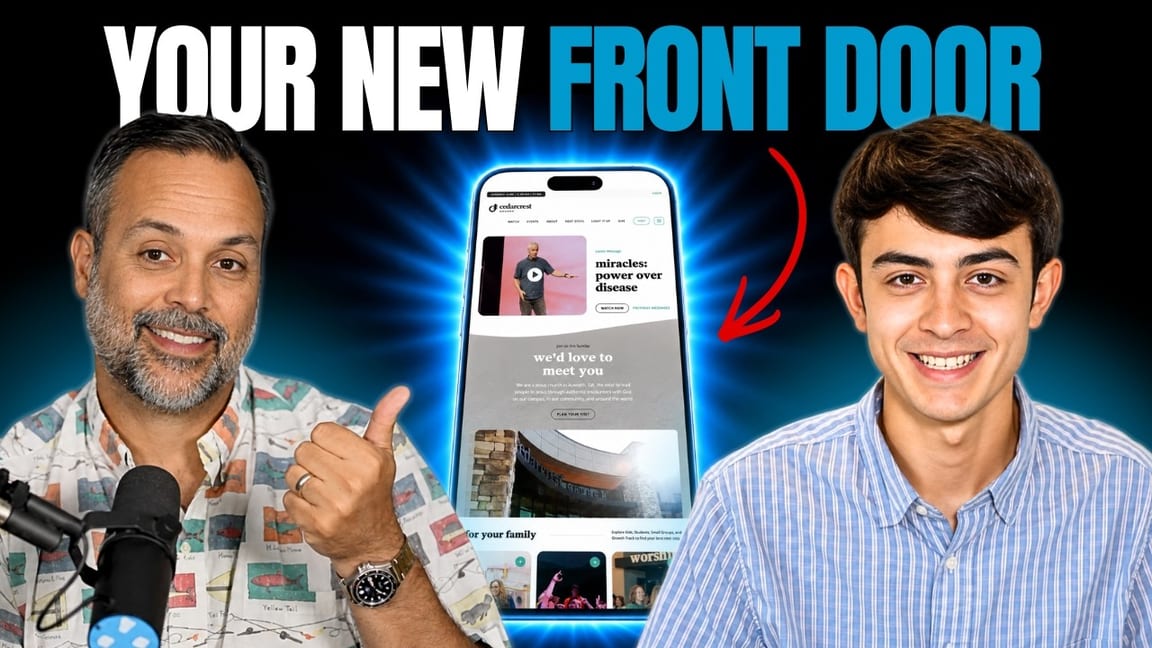
Your Website Is the New Front Door
If you take one thing from all of this, take this.
It used to be that the front door of your church was the front door of your church. So you invested there. Parking team. Greeters. Coffee and donuts. Somebody to walk a new family to the kids check-in. The first-time visitor experience got real attention because everyone understood it was the moment that decided whether people came back.
Your website is now that front door.
For most people who eventually walk into your building on a Sunday, that Sunday is the second time they encountered your church. The first time was your website, on a phone, days earlier. Whatever energy and investment you’d pour into the physical front door belongs there too — because that’s where the decision is actually getting made.
And here’s the encouraging part: it’s a better deal than the old front door. Running a hospitality team well — greeters, ushers, parking, follow-up — is genuinely hard, ongoing, people-intensive work. Getting a good website is much less of a lift than that, and you do it once. Both matter. But if you’re triaging where to spend the next month of attention, the website is the cheaper win.
Your Next Step
Not sure how your church website measures up against any of this? We offer a free church marketing and website review. Our team will do a deep dive on your site, your search presence, and your overall digital strategy — then send back honest, specific marching orders you can actually use. Take it and execute it yourself, hire us, hire someone else. Genuinely up to you. No purchase necessary, no sales pitch, real feedback.
Turnaround is about 48 hours. It’s free for any church that asks.